Serif vs. Sans Serif Fonts: What’s the Difference and When to Use
This page may contain links from our sponsors. Here’s how we make money.
When it comes to fonts, you have millions of options — serif, sans serif, script, handwritten, decorative… but there are two very important categories you need to know about: serif and sans serif.
What’s the difference between them? And when should you use one over the other?
Here’s a quick guide on serif vs. sans serif fonts.
Serif vs. Sans Serif Fonts: What’s the Difference?
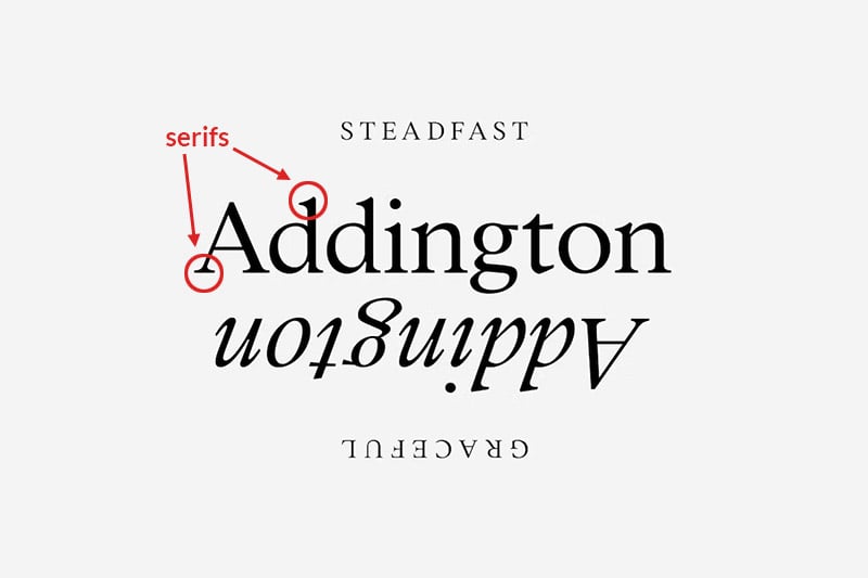
The main difference between serif and sans serif fonts is the type design. Serif fonts have serifs —the small lines or “feet” on the ends of their characters. On the contrary, sans serif fonts don’t have them. (Sans is the French word for “without,” so sans serif literally means “without serifs”).
The example below, Addington, is a serif font. Notice the small feet (the serifs) at the end of each letter. Simply look at the individual letters to identify the type genres.

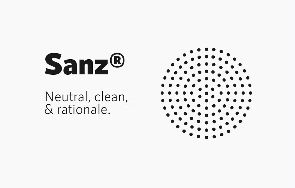
The next example, Sanz, does not have the decorative stroke on the letters. It’s a sans serif typeface because of the absence of serifs.

Serif letters are typically seen as more traditional and formal, while sans serif letters are more modern and casual. Serif fonts are often used for print projects, like books and magazines, while sans serif fonts are better for digital projects, like websites and apps.
Let’s explore these concepts in greater detail.
Examples of Serif Fonts in Design
Some of the most common serif fonts include Times New Roman, Baskerville, Bookman, Caslon, Garamond, Copperplate Gothic, and Georgia. But thousands (if not millions) of unique and interesting serif fonts are available to make your project stand out.
Recognizable logos created with serif fonts include Rolex, Tiffany & Co., Vogue, GAP, Volvo, and Sony.

When to Use Serif Fonts
Serif fonts are traditional, so they’re a good choice for formal and business-related projects, like invitations, resumes, presentations, and other print materials.
They’re also easy to read in large blocks of text (the serifs can help with directing eye movements), so they’re often used for print projects like books, magazines, and newspapers. Serif fonts are a great choice to give your project a classic look.

Consider choosing a serif font if you’re working on a law firm identity package, a luxury brand logo, a project for a financial institution, a vintage poster, wedding invitations, or a magazine layout.
Serif fonts are the best choice to tell a story about a brand’s values, sophistication, and tradition.


Examples of Sans Serif Fonts in Design
Some of the most popular sans serif fonts include Helvetica, Arial, Univers, Futura, Verdana, Franklin Gothic, and Gill Sans. But there are more unique and interesting sans serif fonts than you could ever use in your lifetime, so don’t limit yourself to just using these!
Some recognizable logos that use sans serif fonts include Facebook, Google, Chipotle, Amazon, FedEx, and Adobe.

When to Use Sans Serif Fonts
Sans serifs are more modern and casual than their footed counterparts, so they’re often used for projects like websites and apps. They’re also a good choice for shorter blocks of text, like headlines and taglines, because they’re easy to read at a glance. If you want to give your project a more contemporary look, sans serif fonts are the way to go.

Go for a sans serif typeface when you’re going for cutting-edge, modern, contemporary design. Sans serif fonts are simpler, cleaner, and more approachable than serifs.
These fonts are a great choice for tech-related companies, casual restaurants, party invitations & greeting cards, social media graphics, and branding for startups.


Font Combinations
Combining fonts is an art, and one of the best practices in design is combining a serif font with a sans serif. To do this, serif fonts are usually used for headlines or big statements, while sans serifs are used for body text or smaller details.
Remember to keep it simple, however, when combining different font styles. Stick to only combining two or three different typefaces. Any more than that, and your design will look cluttered.
Look for typefaces with a similar personality to have a cohesive look. When in doubt, you can find a perfectly paired serif and sans serif font duo, like these examples from Envato Elements — the hard work is already done for you!


How to Choose the Right Fonts
Now that you know the difference between serif and sans serif fonts, and when to use each one, it’s time to start choosing the right fonts for your project. Here are a few tips:
• Consider the personality of your project. Is it formal or casual? Modern or traditional? The tone of your project will help you narrow down your font choices.
• Think about the message you want to communicate. Does your project need to be easy to read, or can it be more playful? Are you trying to convey a feeling of luxury or simplicity? The answers to these questions will help guide your font selection.
• Consider the medium you’ll be using. Print or digital? If you’re working on a website, you’ll need to ensure the fonts you choose are web-safe.
Once you’ve considered all these factors, it’s time to start browsing fonts. Envato Elements has a wide selection of both serif and sans serif fonts to choose from, so you’re sure to find exactly what you need for your project.
Final Thoughts on Serif vs. Sans Serif Fonts
That completes our guide on serif vs. sans serif fonts. Each has unique characteristics and purposes, so it’s important to know when to use them. Serif typefaces are more traditional and often used for print projects, while sans serif typefaces are more contemporary and commonly used for digital projects.
When choosing fonts, it’s important to consider the tone of your project, the message you want to communicate, and the medium you’ll be using.
Once you learn these differences, choosing the right fonts for your project becomes almost second nature. So what are you waiting for? Start browsing now and find the perfect font for your next project! Will you choose a serif, a sans serif, or both?
For more on fonts, please see:

