Black and White Design: Examples of Website Layouts for Inspiration
This page may contain links from our sponsors. Here’s how we make money.
Colors can indicate many things in a design: contrast, emotion, style, and even theme. The use of black and white design on the web traditionally leans towards two major websites: creative agencies and news publications.
But this high-contrast color scheme can be used by any site when implemented properly.
Below I’ve collected some of the best sites that rely heavily on black and white colors. Each site uses these colors for a different purpose from minimalism to modernism and crafting a professional demeanor. I’ve analyzed each example to help explain the design elements and how you can incorporate similar ideas into your own work.
Showcase of Black & White Websites
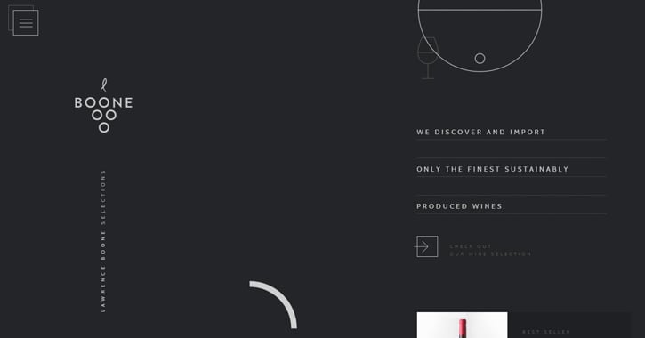
Boone Selections
Lawrence Boone Selections uses abstract design techniques with shapes and oddly-spaced typography. It’s definitely not the norm for a website layout since it has no defined grid or static elements.
It relies on off-shades of dark grey and light grey to lessen the harsh contrast between pure black and pure white.
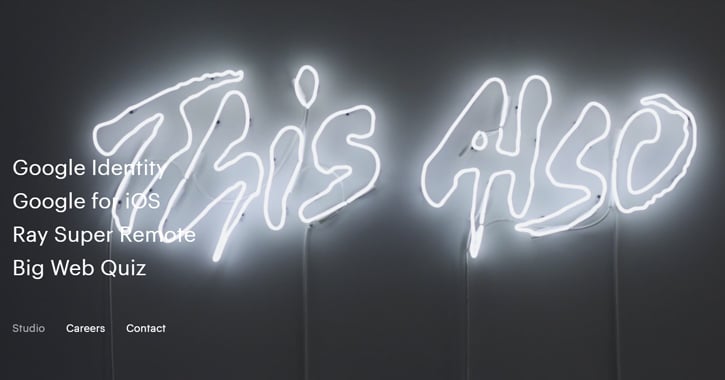
This Also
This Also is a digital creative studio specializing in graphic design and UI design. Their minimalist website uses stark black & white to give clear visibility to all text on the page. It’s not a glamorous layout but it works well and offers concise information about the studio.
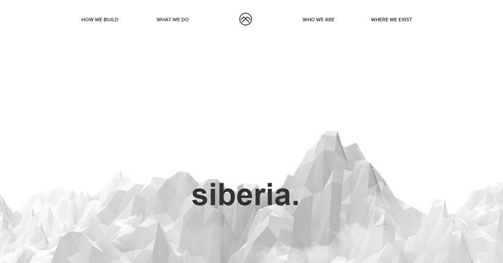
Siberia
Another creative studio Siberia.io breaks up its interface with white and black background sections. Text colors alternate between white and black to maintain contrast.
The site also uses black & white icons with simple flat styles to showcase ideas visually. It’s a design that feels new yet familiar at the same time.
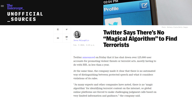
The Intercept
One of the best online news sources The Intercept keeps their design simple so the content can shine. Any given article has a featured header image with white text on a black background. The rest of the page is pure white with centered text.
Overall this design style gives off a feeling of trustworthiness and professionalism. I really enjoy The Intercept for its content, but the design is also incredible which makes reading a breeze.
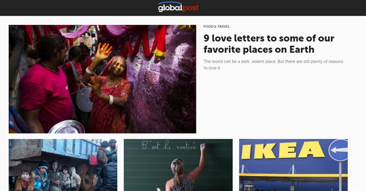
Global Post
Global Post is another great news site with a similar black and white design. News takes center stage and colors are kept to an absolute minimum.
The layout does rely on a few highlight colors in shades of red, but 95% of the layout is pure white and black. This is typical of news websites that want to retain focus.
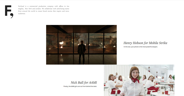
Furlined
The production company Furlined works in advertising and it shows with their quality of work. The portfolio itself is very simple, placing great emphasis on typography and pictures of past client work.
One nice thing about their layout is the repeating grid system. Thumbnail photos alternate from right to left accompanied by plain black text. It’s not traditional but it’s perfect for a digital production agency.
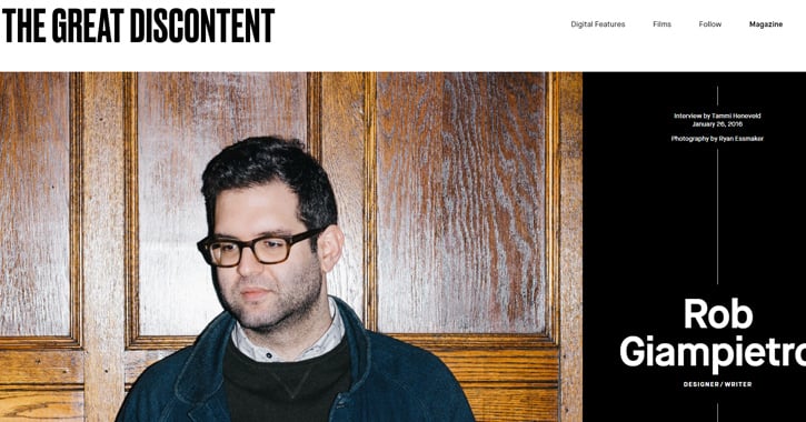
The Great Discontent
The Great Discontent is a major magazine in both web and print. Their website follows a magazine-style layout with heavy focus on the pictures.
Their design naturally relies on typography since content is king in the publishing world. Articles have big photos, oversized text, and a crisp contrast of black and white on every page.
Sid Lee
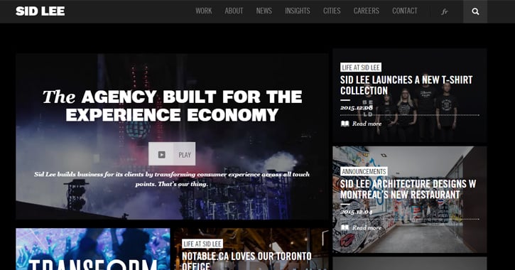
Sid Lee’s site features an odd assortment of grid-like photos and content. It’s controlled with a dark background giving a more personal touch to the layout.
There’s also a strange dashboard page counting real-world data from Sid Lee’s domain. This also uses a plain black-and-white design with plain text and flat icons. This dashboard layout is more like a work of art than interface design, but it’s still worth a gander.
Blissfully Aware
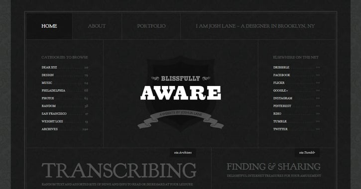
Blissfully Aware is a site run by designer Josh Lane. It’s meant to be a personal site where he can share his opinions on interesting topics.
The design is all black with some texture in the background and borders. I feel it’s more personal to use a dark background, especially in this layout style. Text contrast is lessened with light grey instead of pure white, but it’s easier on the eyes and still clearly readable.
3 St. Jame’s Street
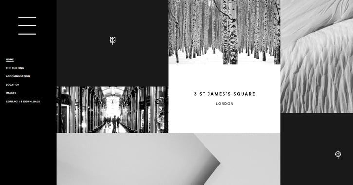
Here’s an interesting site for 3 St James’ Square, a building in downtown London. It’s a relatively simple layout using darker backgrounds mixed with lighter backgrounds and high contrast for text. It’s also one of the few sites I’ve seen using a .london TLD.
Fader
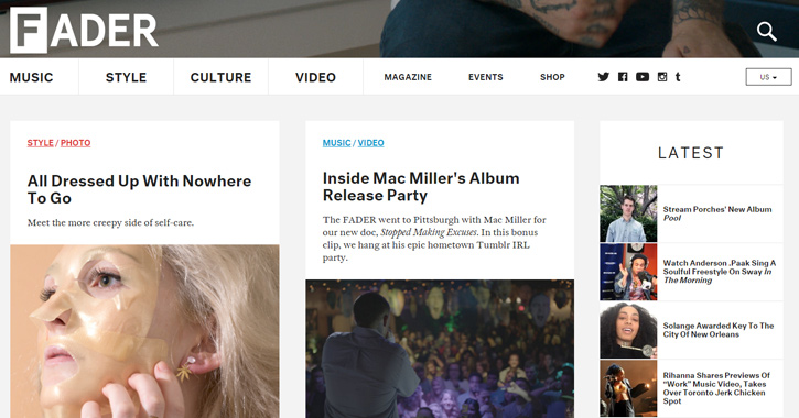
Fader is an online magazine with an exceptionally clean layout. Text falls exactly where you’d expect, colors match up nicely, and everything is easy to use.
In this layout colors don’t give a sense of professionalism, but a sense of modernism. It comes off as a creative arts magazine rather than a traditional newspaper – mostly because of the typography and extra whitespace.
The New York Times
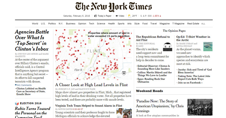
In contrast here’s a site that everyone should know about. The New York Times has been running for over 100 years and continues to be a trusted source for major news. Their site may seem bland, but it does everything right in terms of content focus.
Black and white colors in the NYT website mimic a print newspaper. This may be why serif fonts add to the feeling of professionalism when it comes to news websites.
Master Grinding
Master Grinding is a sales website for chefs and chef-enthusiasts(AKA people who cook). The design uses a centered page of white laid atop a vibrant dark background.
Every page follows this same layout and it’s brilliantly structured with a content-first approach. Content organization could probably use a restructuring, but the layout itself and how it utilizes colors offers a big impact on the reader.

Abduzeedo
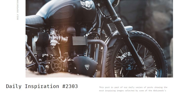
The popular design blog Abduzeedo recently underwent a redesign of dark text on a plain white background. Columns have melded into unseen guidelines for the layout.
Text is still readable but uses monospaced fonts in some areas. The design has received mixed reviews but overall it’s simple, clean, and straight to the point.
70percentpure
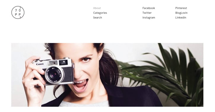
Stephanie Duval is a freelance journalist originally from Belgium. The site 70percentpure is her personal website/blog for showcasing her work in writing and photography.
It’s incredibly minimalist with a horizontal-listed navigation and few links. Content is a little difficult to navigate so from a UX standpoint it’s not perfect, but definitely well-designed – especially for a personal website.
JR & Associée
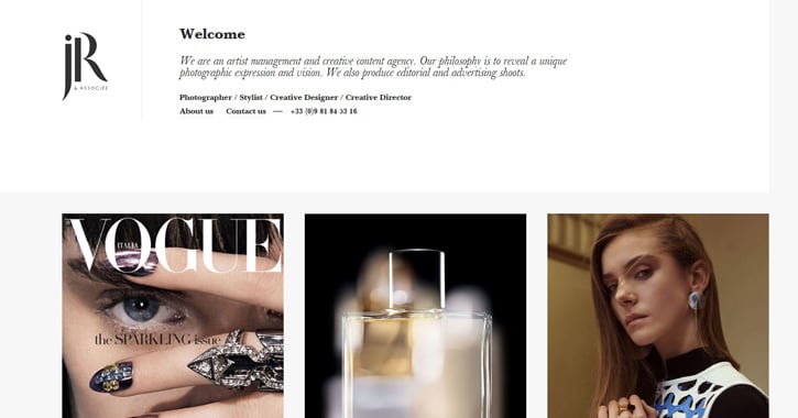
JR & Associée is a management group for artists and creative professionals based in Paris. Their site uses a nice mix of white, black, and grey colors. It’s a wonderful design that feels both professional and free-flowing at the same time.
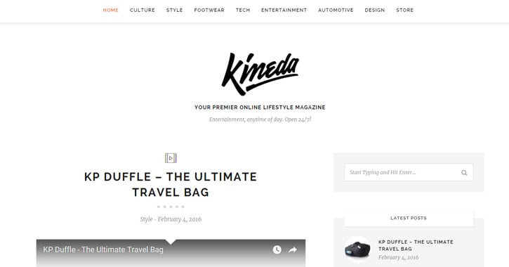
Kineda
Kineda is a self-branded lifestyle magazine focusing on tech, culture, entertainment, and practically everything else. I really like the simplicity on this site because it still feels rigid and structured. Content falls in-line with grids and sidebar widgets also use a bit of color for highlights.
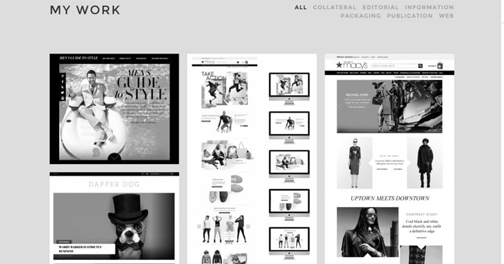
Leah Haggar
Leah Haggar is an artist and digital designer with a portfolio leaning towards the wondrous black-and-white color scheme. Page sections alternate between black and white backgrounds while placing a heavy focus on content. Her images also remain black and white until hovered.
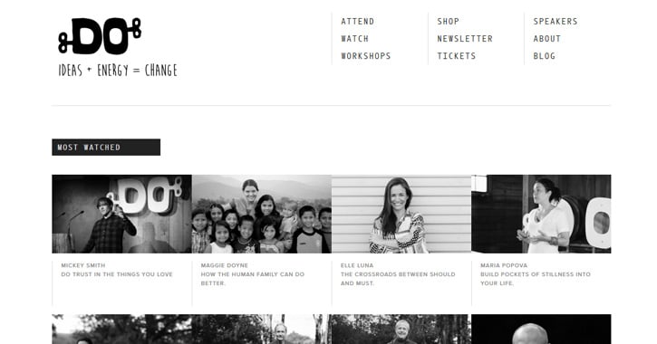
The DO Lectures
The DO Lectures are a series of workshops and talks recorded & published online. The site hosts these videos and related content for interested readers.
It’s a very clean layout with thumbnail photos and crisp typography. The photos are all black & white to maintain consistency with the color scheme.
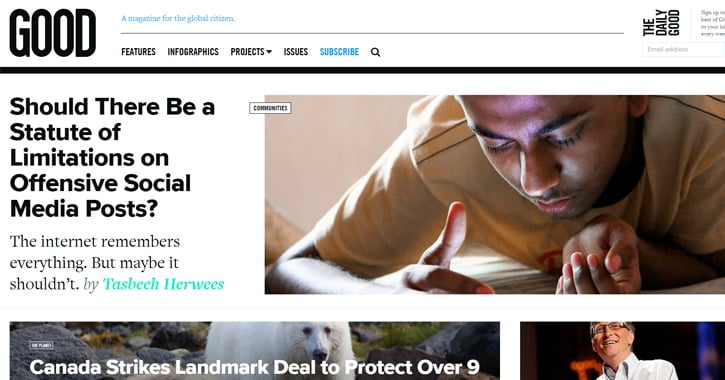
GOOD Magazine
GOOD Magazine has one of the best news-style layouts I’ve seen. It uses very large photography for prominent cover stories to draw attention from readers.
It does use highlights of colors like blue and green for elements that need to stand out. But a typical article page has only a white background, black text, and some photos scattered throughout.
Wired
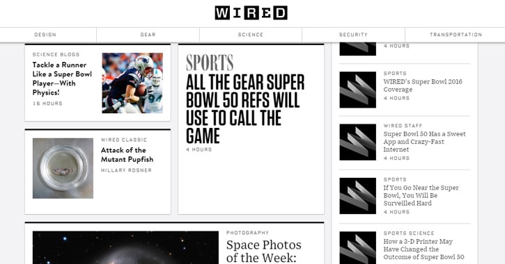
Another well-known magazine is Wired which actually got its start in the print world. Their website layout has remained similar for a few years relying on the card/magazine grid design.
Every story is contained within its own little white box using black borders as a highlight. This same effect is applied to the page header and sidebar columns. Wired uses colors just like GOOD as an outside highlight, but the layout primarily operates on a black and white color scheme.
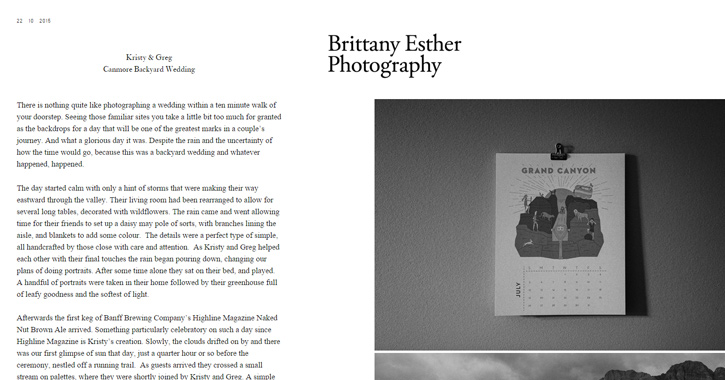
Brittany Esther
Brittany Esther is a photographer and her portfolio uses dark colors as a means of clarity. Since the biggest focus lies in imagery, page text is generally smaller. But the text is placed in a two-column grid and given just as much space as the photos.
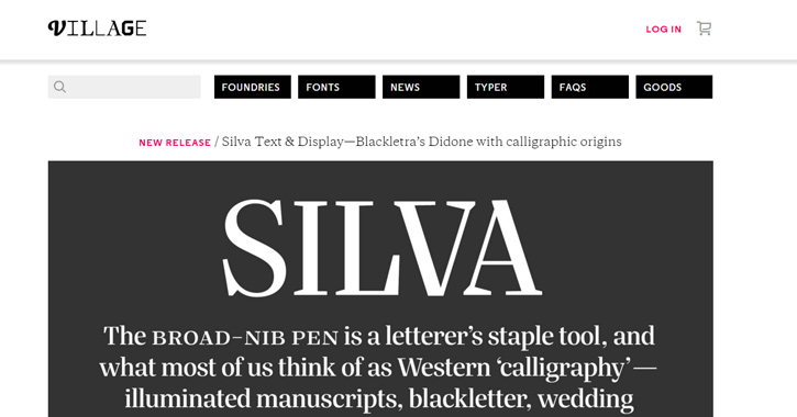
Village
Village is a collection of fonts and typefaces sold by professional designers. The site uses a plain white background across every page with a small drop shadow delineating the header. It works great because the primary focus of Village is typography, so black text on a white background stands out just the way you’d expect.
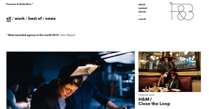
Forsman & Bodenfors
Forsman & Bodenfors is an independent creative agency based out of Sweden. Their site places a heavy interest in typography with big bold headers and a mix of uppercase/lowercase text.
One critique of their site is the content strategy; very hard to figure out what they actually do. But the navigation, readability, and layout design are all perfectly suited for a digital agency.
NY Mag
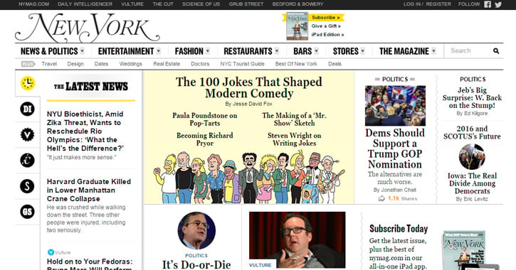
NY Mag relies on a similar layout design as the NYT. Multiple columns, short snippets for headers, and brief thumbnails scattered throughout the page.
It also uses a full black-and-white color scheme which gives off the same impression of being printed straight from the newsroom.
If you’re looking for more web design inspiration check out these articles:

