Best About Us Pages: How to Craft a Killer About Us Page
This page may contain links from our sponsors. Here’s how we make money.
Humans love stories. We’ve been using them to share and receive information for thousands of years; in fact, according to anthropologists, stories are one of the few things common to every culture. In our society, stories account for roughly 65% of personal daily conversation.
What does our obsession with stories have to do with website “About” pages? Great question.
As you know, the average Internet user has the attention span of, well, a goldfish. You barely have any time to engage them before they’re clicking on something new.
Here’s where stories come in. Your “About” page is your opportunity to hook users—to establish some trust, communicate key facts, and ultimately, create a relationship with them.
If you craft a great one, it could end up being almost as important as your homepage. Read on to learn the four elements of an awesome “about” page, and a gallery of some of the best about us pages.
Elements of an Effect “About Us” Page
1. An Inspiring Mission Statement
Somewhere on your page (preferably above the fold), you need a summary of what you do—and more importantly, why it matters.
To see why this component is so important, here’s a hypothetical situation. You’re looking for a new project management tool that’ll help you stay organized, and two apps have emerged as the best choices. However, since they have similar features, reviews, and pricing models, you’re pretty torn.
While browsing their sites, you find their “About” pages. The first says: “We’re the brains behind InControl, a project management app for freelancers and small businesses.”
The second says: “Our mission is to make your life easier. Every day, we come to work excited to build new features and products that’ll take care of the details, so you can focus on what really matters.”
Which mission statement is more compelling? The latter. It shows you that the company really cares about what it’s making; plus, it describes the benefits of the product rather than the features.
By the time visitors arrive at your “About” page, they already have the straightforward definition of your product or services. So rather than giving it to them again, begin your “About” page with an impactful description of your mission. Keep it short and sweet—I wouldn’t go over two sentences.
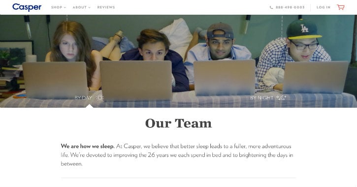
Casper’s intro is an awesome example:
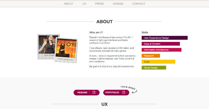
UI and UX designer Erica Firment has a great mission statement as well:
If you’re struggling to define your own, ask yourself, “Why do I make what I do? How do I change or improve my customers’ lives? What’s the non-jargony explanation of my work?”
Remember: When in doubt, present information as a story.
2. Real, Live People
Whether you’re a one-person show (that is, a freelancer or entrepreneur), or you’re running a 40-person digital agency, including pictures of your team members is key.
Because when visitors see the real, live people behind your business, their connection to you instantly deepens. (The best data for this actually comes from LinkedIn—users with pictures are seven times more likely to get profile views than those without!)
Now you’re thinking, “Awesome, I’ll just grab the same headshot I used on LinkedIn, ask my team members for their headshots, put ‘em up on the site, and call it a day.”
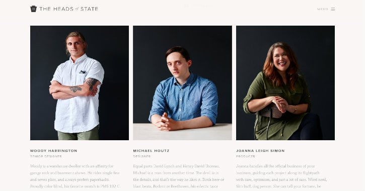
Not so fast. If everyone’s pictures come from different sources, putting them side-by-side will make the page feel less cohesive. For that reason, you should consider investing in a professional photographer. That lets you pick a uniform background, theme, and mood for all of the photos.
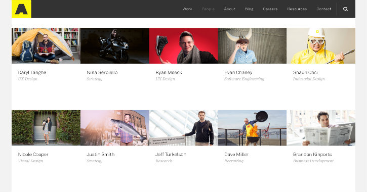
The team member photos on the “About” page for The Heads of State, a digital agency, serve as good inspiration:
Keep in mind that (like every piece of content on your site) your pictures will tell visitors what it’ll be like to work with you. So choose an appropriate tone. For example, if most of your clients are in medicine and health, you’d probably want to go with conservative, serious headshots; however, if you primarily work with tech startups, you could be more informal.
In the latter category, we’ve got Artefact, a tech product design and development agency.
3. A Blend of Fun and Serious Facts
The “About” page is the perfect place to A) show off some personality and B) share a little more about you or your company.
Showing Some Personality
You can give people a sense of who you are by sharing some non-work details: preferably quirky and unexpected ones that they won’t be expecting.
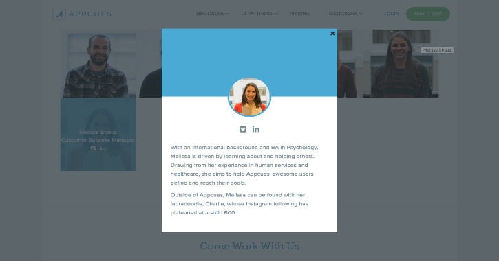
Appcues, a user onboarding platform, did a nice job of using personal details to jazz up their “About” page. When you click on an employee’s headshot, their bio comes up.
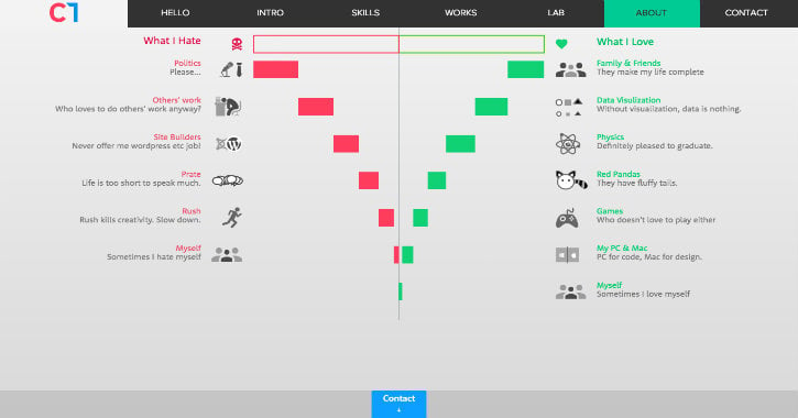
If you’re the only person on your “About” page, you’ve got the freedom to share several fun facts. Take a look at the creative way front-end developer Cihad Turhan visualized his personality:
This technique also works if your team is so large you can’t (or don’t want) to include a mini-bio for everyone.
Duolingo, for example, has created playful graphics to illustrate key stats about its team.
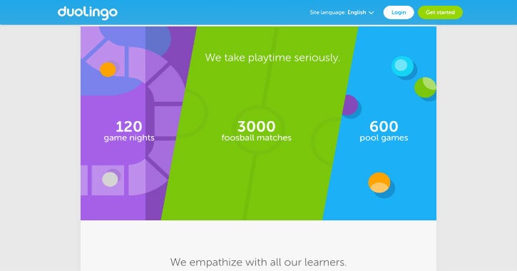
The “About” page tells you employees come from 20-plus different countries, have played more than 3,000 games of foosball and 600 rounds of pool, and are 40% morning larks and 60% night owls.
Educating the Visitor on Your Company
What about the second goal—sharing more about your company? Duolingo’s page accomplishes this goal as well. Along with the fun facts, you’ll find more serious info, like how many people work in each department and the company’s gender diversity ratio.
When choosing what to include on your own “About” page, think about why the user is specifically coming to this page.
In Duolingo’s case, most visitors are likely super users or potential job candidates. After all, the average person won’t be that curious about the company’s internal workings—he or she just wants to use the product.
Duolingo has customized their “About” page to these specific group of brand advocates and future employees, sharing the details they’ll care about.
Visitors to graphic designer Paul Currah’s “About” page, on the other hand, are almost certainly thinking about hiring Currah. So Currah shares his background, notable awards, process, and former clients.
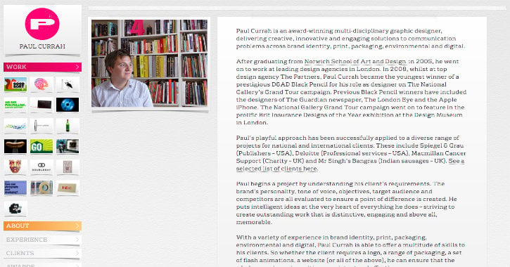
The takeaway: When deciding which information to include, use your audience as your guide.
4. A Strong CTA
This is where 90% of “About” pages fall short. You’ve created momentum with a compelling tagline, great visuals of you or your team, and the perfect balance of fun and need-to-know facts. Now that you’ve got your online visitor’s attention, give them something to do!
If you don’t, they’ll end up clicking the back button or going to another random page—and you’ll have lost your opportunity to determine their next step.
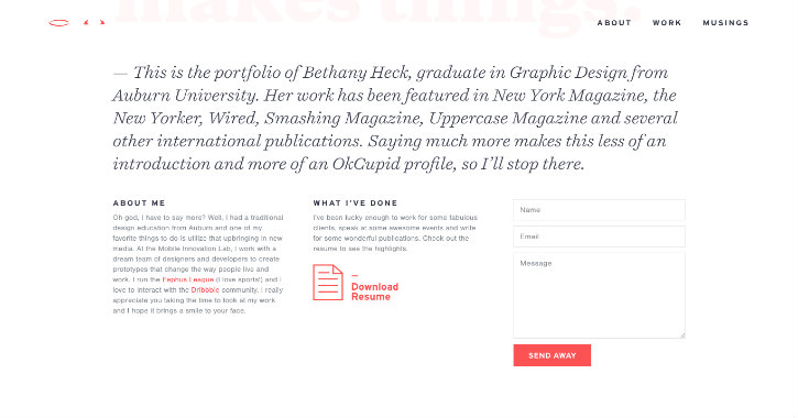
Freelance designer Bethany Heck has not lost this opportunity. Next to the pertinent details, she’s added an email form. As a result, those who like her work don’t even need to open up a new tab to contact her.
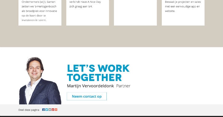
I’m also a big fan of how Have a Nice Day Online concludes their About page. The digital agency is located in the Netherlands, so the copy is in Dutch; however, it’s clear enough that even English speakers can get the gist.
Your CTA should change depending on your high-level goals. If you’re a freelancer, like Heck, motivating people to contact you is your number one priority. Make your email address highly visible (or include a contact form).
Some startups focus their “About” pages on winning clients, meaning their CTA should invite people to fill out a proposal, start a free trial, sign up for a consultation, or whatever channel gets the most conversions.
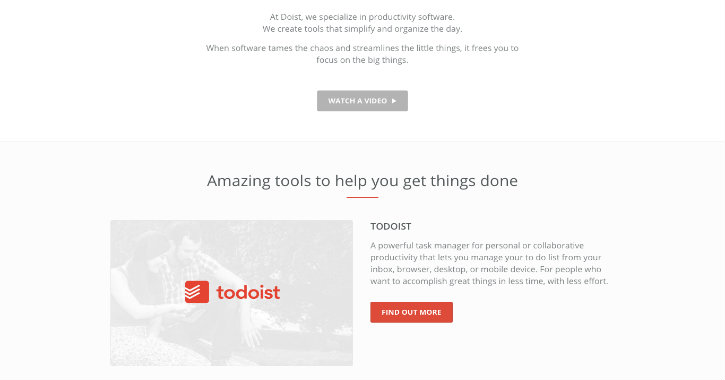
One look at Todoist’s About section, and it’s easy to see it falls into this “client-winning” category.
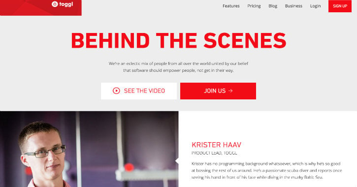
Alternatively, if your company is using your “About” page to drive your recruitment efforts, you should invite people to check out your open positions.
Toggl’s page is clearly designed to appeal to job-seekers:
More Inspiration
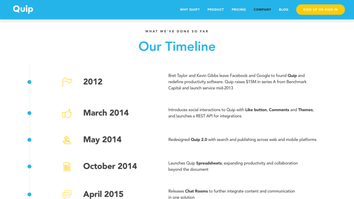
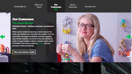
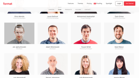
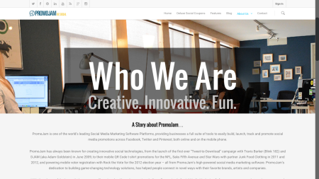
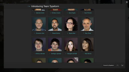
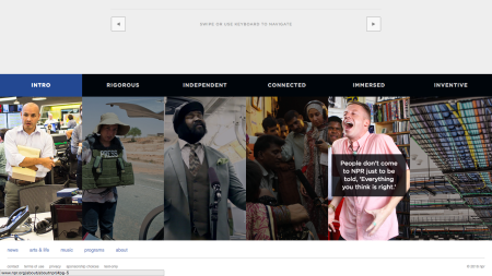
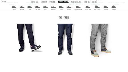
These 13 companies have each done an impressive job with their “About” page:
Final Thoughts
The most effective “About” page tells a story. It begins with a mission statement, which lays the foundation and tells the visitor what to expect. Next, it introduces the characters—who could number anywhere from one protagonist to one hundred. It fills in some of the missing details: Who are these people? What do they like? How do they work? Finally, with a persuasive call-to-action, a well-crafted “About” page involves the visitors themselves in the story.

