Design Trend: Sticky Headers and Navigation Menus
This page may contain links from our sponsors. Here’s how we make money.
Today we’ll take a look at a trend that you’ve probably noticed, websites using sticky or fixed position headers. When a visitor scrolls down the header will remain in view at the top of the browser rather than moving out of view at the top of the screen.
The sticky header can help to make it easier for visitors to navigate through a site as they can quickly access the navigation menu rather than having to scroll back to the top of the page.
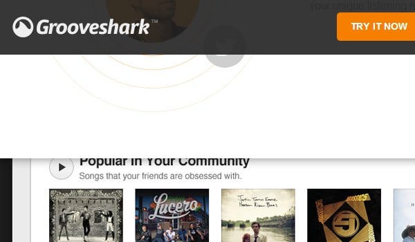
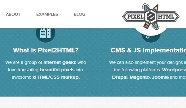
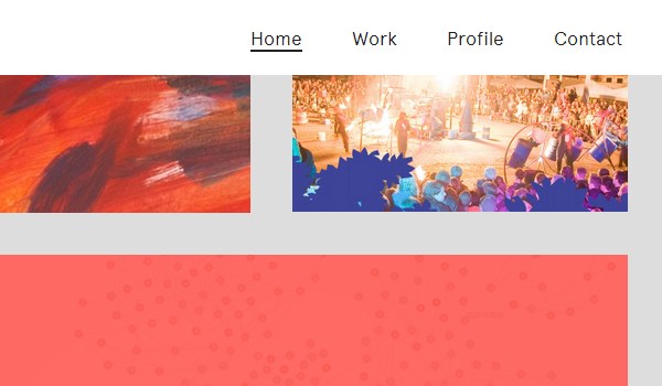
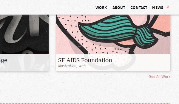
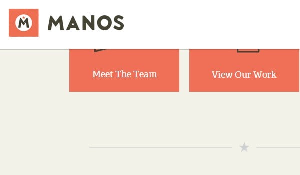
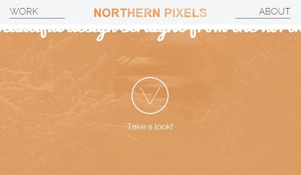
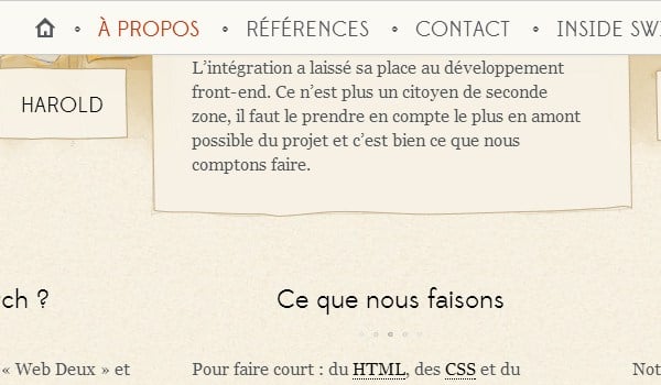
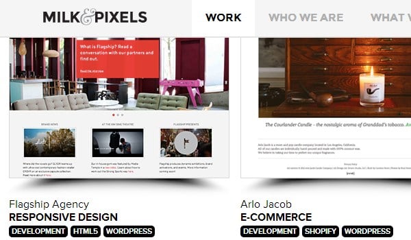
Here we will showcase 25 different websites that are making use of sticky headers. The screenshots show the headers as they appear after scrolling down. Visit any of the example sites to see them in action.
Websites with Sticky Headers
Pixel2HTML


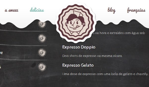






Manos

Heathlife



Grooveshark
