50+ Typography Terms: Glossary of Typographic Terms
This page may contain links from our sponsors. Here’s how we make money.

Do you want to become a master of typography? If so, it’s important that you gain a better understanding of the terms related to fonts and typography.
Learning about these concepts can be daunting if you’re just starting. That’s why we’ve created this guide to demystify 50 key font & typographic design concepts. We’ll show you everything from basic typeface terminology to more complex principles. You can bookmark this page and come back to it whenever needed.
Glossary of Typography Terms
Typography
The art and technique of arranging type, typefaces, and fonts to make written language legible, readable, and attractive when displayed. It involves the thoughtful selection of typefaces and character attributes to create compelling visuals that communicate a message in an aesthetically pleasing manner.
Font
A set of characters, including letters, numbers, and punctuation marks used to produce written content in a particular size and style.
Typeface
A set of letters, numbers, and symbols that share a common design. A typeface may consist of several variations that come in different font weights (e.g. bold, thin), widths (narrow or wide), italics, and other variations.
Although the terms “font” and “typeface” are often used interchangeably, the two terms have slightly different definitions. A font is a specific size, weight, width, and style of a typeface. For example, Times New Roman is a typeface. Times New Roman 16pt bold is a font.
For more details, please read our article Typeface vs. Font.
Character
A character is a single letter, number, or punctuation mark that is part of a font.
Glyph
A glyph is the visual representation of a character, such as a letter, number, or punctuation mark. Multiple glyphs may exist for some characters, for example, if a font includes alternate versions of letters. A single glyph can be modified by changing its size, weight, width, and style (e.g. italic) while still keeping the original design intact.
Stroke
A stroke is a linear element of a character. The weight and width applied to these individual strokes determine the overall look and feel of the font.
Serif
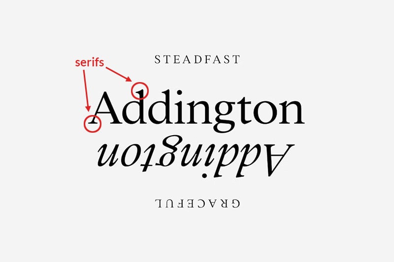
A serif is a small line or decorative stroke added to the ends of characters in some typefaces. Serifs add visual interest, lead the eye across the page and provide structure to a design. They can be used to create contrast between thick and thin lines and help guide readers along texts.

Sans Serif
Sans serif typefaces do not have any additional strokes or decorative elements at the end of each character. These typefaces tend to be more modern, minimal, and clean in appearance, making them a popular choice for corporate branding and signage.
Please read Serif vs. Sans Serif for more details.
Slab Serif
Slab serif typefaces feature blocky rectangular serifs (horizontal lines at the end of each character’s stroke). These typefaces are designed to be highly visible and attention-grabbing, making them ideal for headlines and titles but less appropriate for long sections of body copy.
Terminal
The end of a stroke that does not feature a serif.
Script
A style of typeface that imitates the appearance of handwriting or calligraphy. Script fonts are characterized by a flowing style with distinct strokes. They are often used to convey a feeling of sophistication, elegance, and beauty.
Monoline
A type of font or typeface that consists of all characters with the same width and consistent stroke weight. This typeface typically lacks any serifs and other decorative elements, making it appear modern and sleek.
Display
A classification of font or typeface used specifically for headlines, titles, and large text blocks (not for body copy). The characters are typically decorative, allowing them to stand out against the other typography on the page. Display fonts often feature unique elements such as unusual letter shapes, stylized serifs, or decorative lines that can create a visual impactful.
Grotesk
A type of sans serif font characterized by its simple and minimalistic look, featuring uniform line weight and a lack of decorative elements. Unlike other sans serifs, the strokes of Grotesk fonts are slightly thicker and wider, giving them an overall bolder appearance. This typeface also has terminals at the end of each character.
Pairing
The process of selecting two or more typefaces that work harmoniously together in a design. It involves combining fonts with complementary characteristics, such as different weights and styles, to create aesthetically pleasing and legible contrast.
Family
A collection of typefaces that share common design characteristics, such as stroke weight and serifs. It usually includes variations on the same style, such as different weights, widths (condensed or extended), styles (italics), etc. Font families are often categorized by purposes or visual appearances, such as display or serif fonts.
Weight
The thickness of a typeface’s strokes. A font’s weight may be expressed numerically from 100 (lightest) to 900 (boldest). The higher the number, the thicker and darker the strokes become. Descriptive words like thin, light, regular, medium, bold, and black can also indicate weight.
Italics
Italics is a style of typography that slants the characters to the right, typically used to emphasize certain words or phrases. It can also be used to add visual interest to a design.
Oblique
A slanted typeface. Obliques are slightly different than italics because they are created by simply slanting the characters of a regular font rather than designing them specifically for that purpose. Italic fonts tend to be narrower.
Ligatures
Pairs of characters that are joined together in a single glyph. (Not all typefaces include ligatures.) They are often used to create a more aesthetically pleasing and legible design, such as when two letters overlap. Ligatures typically exist only for letter combinations that are frequently used together, such as “tt.”

Stylistic Alternate
A version of a character with a slightly different design. Like ligatures, alternates are not provided for every font. They often add visual interest and give designers more options when creating type-based designs. Alternates allow you to create text that has a custom-designed appearance.

Swash
A typographic embellishment that adds character to letters. It consists of extended or exaggerated strokes and curves, often in script fonts. Swashes are often used for a word’s first or last letter to decorative touch. Some typefaces include swashes, but many do not.

OpenType
A format (.otf files) for digital typefaces that includes advanced features such as ligatures, stylistic alternates, swashes, fractions, etc. This allows designers more flexibility when creating type-based designs. Designers may need software (like Adobe Photoshop or Illustrator) that supports OpenType features to take full advantage of these capabilities.
TrueType
TrueType is a popular font format developed in the late 1980s. It’s a vector-based type format that stores data on the outlines of characters, allowing them to be scaled and manipulated without losing quality or resolution. This makes it ideal for displaying typefaces on computer screens and printing them in high resolution. However, TrueType does not support advanced OpenType features like ligatures, alternates, etc.
For more details, please read OTF vs. TTF: Which Font Format is Better?
Point Size
Point size is a measurement that indicates the size of the characters in a typeface. It is measured from the top of the tallest ascender to the bottom of the lowest descender and then rounded up to the nearest whole number. Point size is typically expressed in points (pt) equal to 1/72 inch.
Uppercase
The larger form of letters in a typeface. Uppercase letters are used at the beginning of each sentence for proper nouns and acronyms. Fonts with uppercase characters have higher x-heights than fonts without uppercase characters.
Lowercase
The smaller form of letters in a typeface. Lowercase letters are typically used for the majority of words in a sentence. Compared to uppercase letters, lowercase characters have a much lower x-height. Most fonts and types include both uppercase and lowercase letters.
Small Caps
Small caps are a style of typographic lettering slightly larger than the lowercase letters in a typeface but still smaller than the uppercase letters. With small caps, all characters in a given word or phrase will appear at the same height and size.
Body Copy
Body copy is the main text or a long section of the text, usually set in a serif or sans-serif font. It comprises letters, words, and sentences arranged cohesively to communicate information or tell a story. Body copy can be set in any size or style of typeface, but typically it is set in a legible, readable typeface.
Accented Characters
Accented characters are typographic characters modified to include special accents or diacritical marks. These marks, commonly found in languages such as French, German, and Spanish, differentiate similar sounds and change the pronunciation of a word.
X-height
An important measurement for typefaces that indicates the height of lowercase letters. It’s measured from the baseline to the midline of a font and is used as a reference point when comparing typefaces. X-height typically ranges from 44–48% of the overall font size and can have a large impact on the readability of a font.
Leading
The vertical space between lines of text. It is measured from baseline to baseline and is usually indicated by a number corresponding to the typeface’s point size. For example, if you use 12pt type, the leading would typically be 12pt. Increasing leading adds white space between lines
Kerning
The process of adjusting the spacing between individual characters in a font. It creates visual balance and ensures an even, uniform appearance of words and phrases in a design. Kerning can adjust the space between letters, numbers, punctuation, and other symbols.
Tracking
The process of adjusting the overall spacing between multiple characters in a font. It is designed to give the text a more uniform, consistent appearance and can make words and phrases easier to read. Tracking usually works on a set of characters, such as a word, phrase, or line of text.
For more details, please read Leading vs. Kerning vs. Tracking.
Legibility
Relates to how readable a font or typeface is. It is determined by factors such as x-height, character shapes, and the overall spacing between characters. Legible fonts are clear and easy to read, while illegible fonts can be difficult to decipher and may require greater effort to read.
Placeholder Text
Placeholder text is generic text used to demonstrate the visual appearance of a document or website without using real content. It is frequently used in typography and graphic design projects, such as designing logos, layouts, brochures, and other printed or digital materials.
Lorem Ipsum
Lorem Ipsum is a placeholder text commonly used in typography and graphic design (usually beginning with the words “Lorem ipsum”). It’s a dummy text composed of a mixture of Latin words, popularized during the 16th century by the typesetting and printing industry.
Baseline
Refers to the imaginary line on which most letters in a font rest. It determines the vertical position of characters relative to each other and sets a guideline for the overall height of a block of text. The baseline helps create uniformity and consistency across lines of text.
Cap Line
Refers to the imaginary line which caps, or upper-case letters, rest on. The cap line allows capital letters to appear the same height and size as other characters in a font.
Ascender
The part of lowercase letters that extends above the x-height. It usually applies to certain character sets such as d, b, h, k, and l. Ascenders give visual relief to text and create contrast between different letterforms.
Descender
The parts of lowercase letters that extend below the baseline. In a typeface, descenders appear on characters such as g, j, q, p, and y. Descenders serve to create visual balance in a block of text and help provide contrast between different letterforms.
Aperture
Aperture is the shape of the counter, or enclosed space, within a letterform. It is an important factor in determining the legibility and readability of typefaces, as it affects how much white space there is between characters. Apertures can be opened or closed depending on the design of a font.
Crotch
The angled intersection between two strokes of a letterform. It is used to create visual balance and interest within a typeface and to provide contrast between different characters. The angle of the crotch varies depending on the design of a particular font, and it can be either acute or obtuse.
Arm
An arm is the horizontal stroke of a letterform which usually extends from the left side of the baseline to the right. It can be used to distinguish between fonts and create contrast between different letterforms.
Stem
The vertical stroke of a letterform that extends from the baseline to the cap line or above.
Shoulder
The curved stroke that connects the ascender to the stem, providing subtle visual relief and contrast between different characters.
Crossbar
A crossbar is a horizontal stroke that connects two distinct vertical strokes in a letterform.
Widows & Orphans
Widows and orphans are terms used in typography to refer to isolated words or lines of text that appear at the beginning or end of a paragraph, column, or page. A widow is a single word that appears at the end of a paragraph, while an orphan is a single line that appears at the beginning or end of a column. Widows and orphans can disrupt readability and should be avoided if possible.
Web Font
A web font is a digital font that can be used on a website or application to display text in a certain style. They are typically provided in formats such as WOFF (Web Open Font Format), EOT (Embedded Open Type), and TTF/OTF (TrueType/OpenType). Web fonts allow users to view text in a specific font, even if it isn’t installed on their machine.
Dingbat
A typographical symbol or ornament that does not represent an alphabetic character. It can be used for decorative purposes. Dingbats are typically small images such as arrows, stars, checkmarks, and hearts.
Final Thoughts on Typography Terms
Learning the terms associated with typography can help you make informed decisions when selecting a font for your project. It’s essential to understand the basics of letterforms and how they interact to create readability and legibility in a typeface. With this knowledge, you can choose fonts that best suit your design needs.

