B2B Websites: Best Examples for Your Design Inspiration
This page may contain links from our sponsors. Here’s how we make money.
Today, every company, brand, or business needs a website with a simple user experience and an appealing appearance. The website should attract prospective customers, accurately reflect an authentic brand voice, show companies how you can help them meet their business goals, and make it easy for potential customers to become paying customers. B2B companies are no different!
When designed effectively, B2B websites will accomplish all these things and leave visitors with a positive overall impression of your business.
B2B Websites
In the showcase of B2B sites below, we explore some of the techniques and strategies these companies use to create a cohesive, on-brand design and promote a seamless user experience. Continue reading to get inspired for your own B2B website!
Also check out some of our other showcases, like financial website design, insurance websites, and SaaS websites.
Monday

When visitors come to your site, they’ll be interested in the services you provide, but along with services, pricing is one of the top items they’ll also be considering when making a buying decision. Good B2B sites make pricing information easy to find by placing a link to their pricing plans page in a visible place on their website, like in the header.
On the header of Monday’s website, we can clearly see their pricing page. When we click on it, we see all of their pricing info is neatly organized into a pricing table that lets us know how much each plan is and what it includes. The basic, standard, and pro plans are even color-coordinated, so we can differentiate between them. Consider a similar strategy when planning the layout of your B2B site’s pricing page.
Zendesk

For a clean and modern aesthetic, consider modeling this website’s minimalist design. Zendesk uses a limited color palette, simple shapes, and bold sans-serif fonts to create a seamless look that promotes easy readability throughout the site.
The website also has simple animations sprinkled throughout the design to subtly point us to clickable links, which is good for usability and readability.
For example, when we move our mouse over the links in the top header of the page, an underline appears over the links on hover. As we further move our mouse over the options in the drop-down menu of each heading, each option pops out from the rest so we can clearly see what we’re about to click.
Small animations like this make a big difference in ensuring a website is easy to use and read, especially when there’s a lot of information in one small space.
Squarespace

Squarespace is another great website to reference that uses subtle animations to promote readability. As we scroll down their home page, we notice that headings and text float onto the page. This guides the reader’s eye down the page and keeps visitors interested in scrolling down the page to see what’s next.
The best B2B web designs hook visitors’ interest and keep them clicking on the site, so adding tiny animations to your website like Squarespace has is an effective way to keep people on your site. A bonus: The seamless animations will help your site maintain a nice and clean design.
Infostarters

Minimalist designs and transitions are two big design trends we commonly see in websites, but if you’re looking for flashy designs that are a little more bold, check out Infostarters’ website. Infostarters is a business-to-business company that specializes in print, publishing, and infographic design, so it makes sense that their site displays creative icon designs.
These icons work very well for navigation. For example, if we click on the “How It Works” tab on the left-side menu on the home page, we’re brought to a section of the website that explains (as the header suggests) how Infostarters’ workflow is after a customer signs on to work with them.
As we navigate through each slide using the arrow keys on our keyboard (another unique function of this site), each icon changes along with the information on the page, giving the entire page a slideshow feel.
Inserting a slides section like this, with transitioning graphics, adds visual interest and readability to your site. Plus, it means your reader can view all the information they need without continuously scrolling down the page.
Overpass

One goal you’ll likely want your website to accomplish is to build trust with possible clients. A testimonial or reviews section will do just that. Word-of-mouth is still the most effective way to advertise any kind of service because if others trust it, we will likely trust it too!
Overpass includes a customer testimonials section on its home page. If we scroll down, we’ll see they feature three testimonials that automatically switch from one to another. There’s also an arrow function on the left side so readers can switch back and forth through the testimonials without waiting for them to switch.
Including testimonials in this way will not only build trust with potential customers but also give your business credibility and showcase some of your business’s best work. A testimonials page is essential for any business website.
Reputation Squad

Reputation Squad’s website has a very cool 3D effect that rotates out photos as we scroll through the home page. Rather than scrolling down the page, however, we scroll from left to right, and the images maneuver around the screen, making us feel as if we’re in the room where the photographs are taking place. These impactful images create a corporate, serious feel to the site.
As we click on different pages throughout this website, it becomes clear that much of their web design relies on high-quality images moving with the page. If you want your site to focus less on illustrated graphics and more on photographs, Reputation Squad’s site is a fantastic example to reference.
Square

Square’s website has a more simple, modern, and clean design defined by bold typography, simple shapes, and high-quality photos.
As we scroll down the home page and come to the “Imagine Your Business Here” section, we can see a clear example of how business owners can use Square’s services to optimize their business.
By clicking the plus-sign buttons, we can see what each of Square’s products can do for us. This intuitive design allows us to imagine how our own business will function if we use Square’s services, making it likely that we’ll reach out for more information or purchase their services.
Consider adding a similar feature to your website to help potential customers see how your B2B business can meet their needs.
Shopify

Another goal that effective business-to-business websites accomplish is generating quality leads and transforming those leads into sales. You may have noticed that many of these sites offer some form of a free trial for potential customers.
Shopify lists its free three-day trial on its home page and an email field to sign up, making it easy for visitors to register and give their services a try without commitment.
Offering an incentive like this, and displaying it prominently on your website, will help B2B customers determine if your services are right for them. It will also help you identify possible leads, which in turn will help to boost sales. Many business-to-business sales start with a free trial, so consider using this strategy on your site.
Rocket.net

Many B2B companies include a space on their website for active users to sign up or log in to their accounts directly from the site. It sounds obvious that users should be able to easily access the login and signup platform, so consider placing it where people can’t miss it, like in the top header. On Rocket.net’s homepage, we can clearly see how to sign up or log in because they placed a login and signup button where we can easily see it in the top right corner of the page.
When we click on either the login or signup buttons, it brings us to a two-column page. On one side, we can log in, and on the other, we can sign up if we don’t have an account. Consider adding a similar layout to your login and signup pages so people can conveniently access or sign up for an account.
ReminderMedia

If your B2B is a content marketing agency, a web design agency, or even a print and graphic design agency, then you’ll definitely want to check out ReminderMedia’s website. Their website is full of features and elements that are particularly effective for websites in the design and marketing industries.
One of our favorite features is the sample print magazine located on their homepage. We can click through the sample slides and look at their work, so we have an idea of what their business can do right away. Whether you design print materials, websites, social graphics, or anything else, this is a cool way to immediately showcase some of your business’ best work.
The “See Sample” button brings us to another page that prompts us to sign up for a live demo. This is an effective way to nudge people to request a demo and speak with a sales representative (which is good for the business), plus it will help qualify B2B buyers who can truly benefit from your service.
Vidyard

For some businesses, it may be beneficial to include a resources section on their website so their customers can continue learning about the products, tools, and services they purchased and truly know how to get the most out of them. Vidyard has a resources section that can be accessed from the top header of the home page.
If we click on the “Resources” header, a dropdown menu appears, and we can see they offer their customers a knowledge base, templates, a blog, and even a content library. Your business’s resource section can be as big or small as is suitable for your customer’s needs. Having resources encourages your customers to continue to be active users of your site and builds a relationship as customers use those resources over time.
Edda

The gradient colors that change as we scroll down the home page of Edda’s website add a fun touch to the entire website design. By pairing this changing background with the motion graphics that move seamlessly across the page as the colors change, our eye is guided down the page when we scroll, making for a unique reading experience.
As busy as Edda’s website is with changing colors and moving graphics, it’s still done in a way that doesn’t distract from the site’s usability or readability. It can be very easy for elements like this to clash when we use them together, so be sure to reference this site if you want to use a similar design technique that doesn’t turn into a confusing eyesore for visitors.
Help Scout

Does your business have any awards or accolades you want to show off? Consider including them on the home page too! These don’t have to be the page’s main focus, but including them in a small section of the layout, as Help Scout does, will earn the trust of potential customers and let people know that your business is one of the best in the industry.
Under the Help Scout’s awards section, we see a link that brings us to a page featuring customer stories. Just like reviews, showcasing customer stories in this way helps show how your services positively impact other businesses. Chances are, your customers will love to be featured in content like this because it gives them exposure to their business. It’s a win-win!
Semrush

Semrush uses bold, trendy colors and helpful animations throughout its site to create a modern, energetic aesthetic and an easy user experience. What we love most about this site, though, are the interactive elements that keep information organized and easy to navigate.
On Semrush’s home page, when we scroll down, we come to a section titled “See What’s Inside” and an interactive slide deck showcases each of their services. Having readers click through slides prevents them from having to endlessly scroll down the page to read, and it’s an effective way to keep a lot of information nice, neat, and concise.
Design Pickle

We’ve mentioned that price will probably be one of the major factors influencing buyer motivation. Including an interactive pricing calculator, like Design Pickle does on their website, will help customers quickly determine how much your services will cost without having to reach out to your team and wait for an answer.
To access Design Pickle’s pricing calculator, click “Resources” in the top header of the home page and then choose “Cost Calculator” in the dropdown menu. The calculator guides us through a few simple questions like how many deliverables we need, how many hours the project will take, etc. (For Design Pickle, it’s about custom graphics, but you can tailor your calculator’s questions to fit whatever service your business provides.) After that, we input our email, and see our estimate.
This is a great way to provide site visitors with a useful tool they’ll actually use and provide your company’s sales team with warm, qualified leads — it’s something everyone will benefit from.
Blake Envelopes
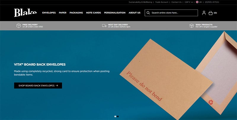
For B2B sites that need to showcase actual, physical products as opposed to virtual services and deliverables, Blake Envelopes is a fantastic site to go to for inspiration. They sell physical products (envelopes and mailing supplies), so their site is designed to accommodate a product catalog and listings.
There aren’t quite as many creative design elements in this website since most of the focus is on their product, but they still use the basics of web design to create a nicely organized and easy-to-use website. They have a header at the top of the page complete with dropdown menus that feature all of their products, a hero image, a search bar, and both a sign-in and cart button.
Stripe
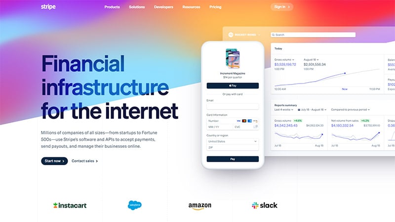
Stripe’s website features vibrant colors and big, bold graphics that give the site a modern look.
The mockup graphics, in particular, are a great way to show potential buyers what your software, app, web design, or user interface looks like. If your business offers digital services through a software platform, consider using similar graphics on your site.
GoCardless
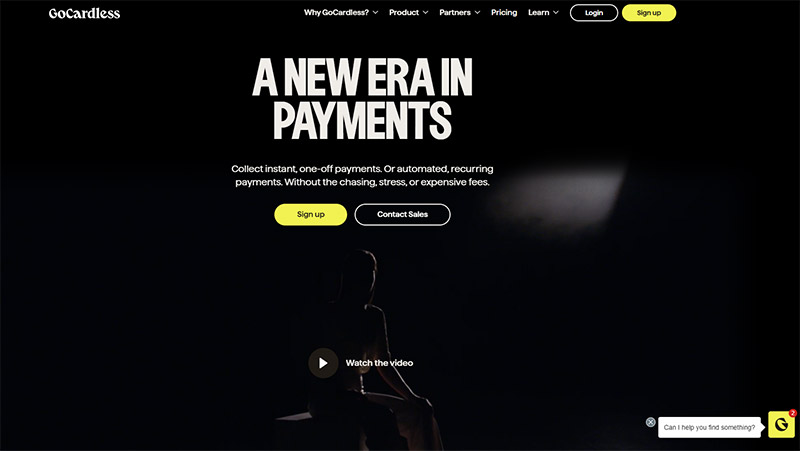
GoCardless uses contrasting colors, bold fonts, modern graphics, and mock-up images to create a site that’s both easy to read and use.
People who visit their site (or any B2B website) will probably either be existing customers logging into their accounts or potential customers looking for information and sales assistance. They place a signup, login, and “Contact Sales” button on the front page so visitors can immediately do what they need to do. (Note how they’re also designed in a color that contrasts with the rest of the page, so they’re easy to see!)
Sprout Social
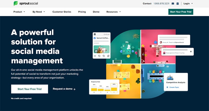
This website combines all elements that make an effective website, but one standout feature is the pop-up that appears right as we leave the page.
If we open up the website in our web browser, open up a new tab, and navigate away from the website, a pop-up grabs our attention before leaving the site. This immediately pulls us back to their website and nudges us to consider signing up for their services. This is an effective way to entice potential customers to the site and encourage them to try the service with a free trial.
Elegant Themes
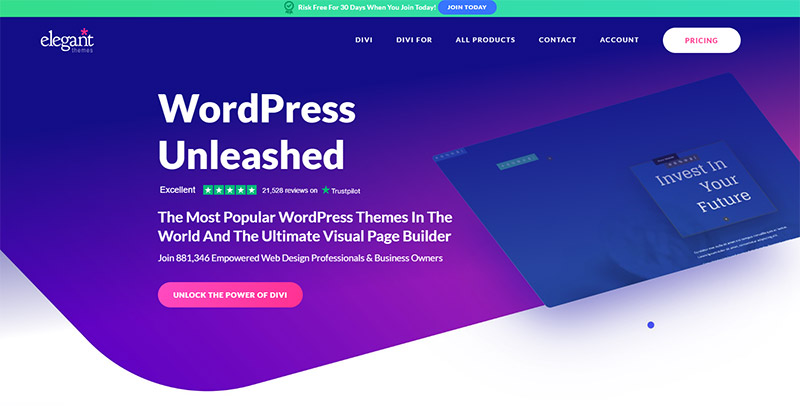
Our favorite feature of this website is the subtle animation they use throughout the site.
For example, on the background image of the home page, we see a looping demo of Elegant Themes’ software tools. As we scroll down, we see more demos, mock-ups, and illustrations that guide our eyes as we read and highlight the most important information on their site.
Unrivaled
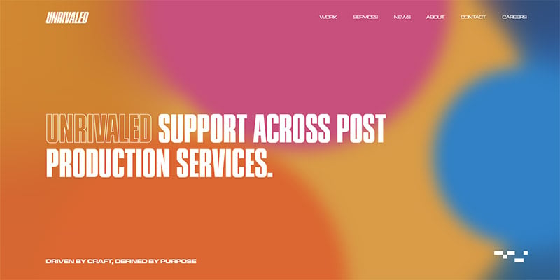
Unrivaled’s website is pretty simple and straightforward. You’ll notice the site doesn’t have a header or drop-down menu that most of the other B2B sites in this list have.
Instead of navigating the site through a menu, we simply scroll down the homepage, where we see only a couple of links that lead to pages about the company and their recent work. If you want a site that’s easy to maintain, doesn’t have a ton of pages or links, and points potential customers to speak directly with your business, this type of website design could be a good fit.
Iconosquare
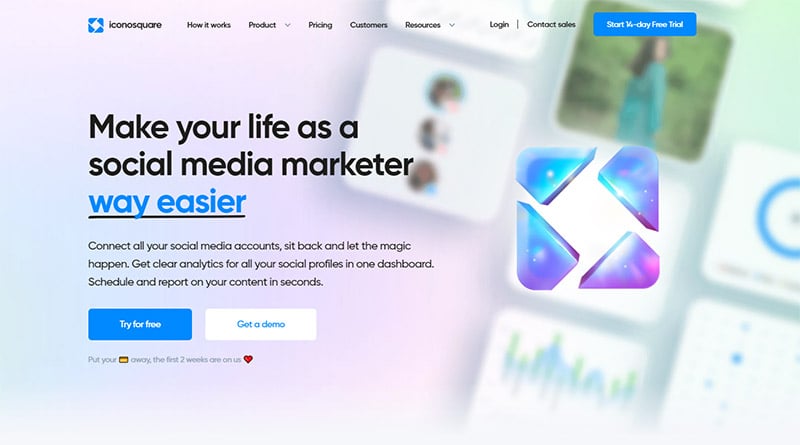
This website is an all-around effective and visually-appealing site, but we particularly love the static menu bottom that stays in the top right corner of the screen as we scroll down the page.
The simple circle icon keeps the menu from getting in the way of what we’re reading on the page, and since it’s sticky, it’s always there for us to use when we’re ready to navigate to another page.
Instead of scrolling all the way up to find the menu, we just simply have to click the button without going back to the top of the page. This is a small detail, but it makes a big difference in the site’s overall usability.
HubSpot
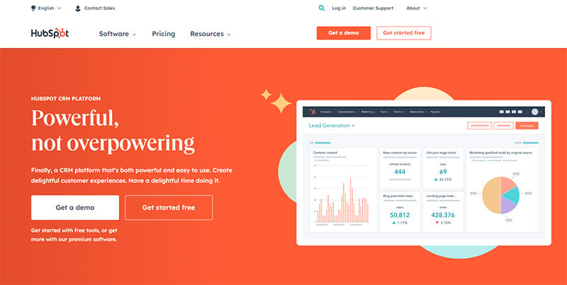
There are a lot of elements that make HubSpot’s website great. From easy call-to-action buttons and an organized header at the top of the page to the unique accordion-style tabs and links at the bottom of the page, this site has everything needed to provide visitors with a seamless user experience. There’s even a chat box at the bottom right corner of the page so we can easily contact customer service if we need to!
FastSpring
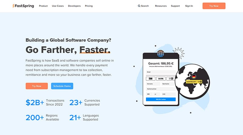
The cute, minimal illustrations and clean color palette make this site visually appealing and interesting to read! FastSpring’s site is pretty text-heavy, so adding images and illustrations helps to break up the text and makes reading the site easier on the eyes. Being intentional with graphics throughout the website goes a long way in elevating the look and usability of the entire site.
Airfocus
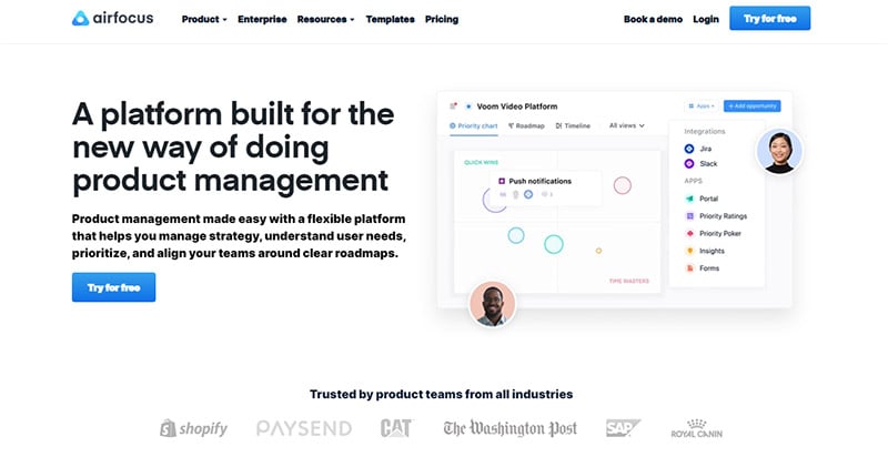
Airfocus uses calls to action, short demo clips, and minimal colors to give its site a clean and simple look.
Their site uses most of the elements we’ve covered to create a clean and effective design, so click through the pages to get inspired for your own site!
Tips for B2B Website Designs
1. Know Your Target Audience Well
The first thing you need to set up a successful site is a clear idea of your target audience. To find your target audience, consider your customer base, your customers’ interests and goals, what they are looking for when shopping for a B2B product or service like yours, and more. It’s a good idea to conduct market research, analyze competitor sites, and even create customer personas to help you clearly identify your audience.
If you know your audience, know what they need, and can pinpoint what motivates them to purchase a service or product like yours, you’ll be able to create an effective site that caters to your audience’s needs and interests.
2. Clearly Explain Your Products & Services
It sounds obvious, but a large portion of your site needs to clearly explain your products and services and what they can accomplish for your audience.
As we saw in the examples above, this can be done in various ways, but you’ll likely want to feature this information on the home page and include a page specifically for products and services. You may also consider organizing your products and services according to your sub-audiences or the solutions your products and services provide.
Along with text descriptions of each service and product, you can also include graphics of what your product or service looks like and videos of how it looks when it’s in use. Also, remember to include a demo request button or signup button to help potential customers take action that will help convert them into paying customers.
3. Incorporate Video
Video is a powerful way to keep people on your site while adding a modern look to the site’s overall design. Videos are also good for breaking up text and can often be a more effective way to communicate a message to your audience.
Whether the videos on your site include product demos, a company representative or employee talking about your business or service, or even background videos that are purely there for aesthetic purposes, incorporating video in some form can be very beneficial for your site.
4. Build Credibility
Building credibility is one of the main goals of any B2B website. After all, people are more willing to purchase a product or service if they know it will work and that it will help them achieve their business goals.
Featuring customer testimonials, case studies, and any awards or special achievements your business has earned is the most effective way to build credibility with your site’s audience. You can also have a portfolio page if your B2B business produces any kind of deliverable, like graphic designs, packaging designs, or websites.
Additionally, feature quantitative facts about your business, like the number of customers you’ve worked with or data that reflects how other businesses have benefitted from your service. When potential clients see these numbers, they’ll know you’re selling a trustworthy, high-quality product or service.
5. Include Calls to Action
Calls to action (CTAs) are what readers to take action and do something that will (hopefully) start their journey as new customers and get them closer to becoming paying users of your services.
We see calls to action everywhere in web design, especially in the site examples above. Some possible examples of calls to action you may find useful are:
- Speak to a Sales Representative
- Request a Demo
- Get Started
- Sign Up
- Ask a Question
- …and more!
CTAs will not only boost leads and user activity on your site, but they’ll also make it easy for visitors to know how to do certain things like contacting customer service or requesting a demo.
Final Thoughts on B2B Websites
By following the tips above and incorporating elements from the B2B websites we highlighted in this article, you can create a site that is easy for your audience to use, motivates them to request a demo, sign up, or purchase your product or service, and builds trust and credibility for your business.
When you make it your own by adding on-brand graphics, video, and color, you’ll have an effective website that accurately reflects your business and can achieve both your business goals and your audience’s goals.
These things will ensure your site looks and functions its best and help set your business up for success.

