30 Pink Websites for Your Design and Color Inspiration
This page may contain links from our sponsors. Here’s how we make money.
The worldwide web is a place of innovation. It’s a fast-paced environment where your business can be a competitor or can get lost in all the noise online. Graphic design has become an ever-evolving paradigm that people in the field need to continually keep learning and staying up-to-date with the next cutting-edge technology or looks.
When you think of feminine products or movements, you think of the basic design element and color palette that includes pink. Pink is the coin color to draw attention to something that is beautiful and classic.
Color psychology plays a huge role in design. Pink is a symbolic color that pulls on the emotions and psyche of the viewer. There can be great connotations to the color pink, and below there are 30 pink websites highlighted to give you inspiration of why as a designer you should paint certain clients’ projects pink!
Showcase of Pink Websites
A graphic designer can employ pink websites to speak for their clients. Pink color palettes are strong, yet subtle as to not shock the audience, but rather draw them in. Design features such as pink typography, pink backgrounds, or elegant design help to inspire a cohesive design that works off a focal point and theme for the client. Let’s look at some great examples of employing pink on screen!
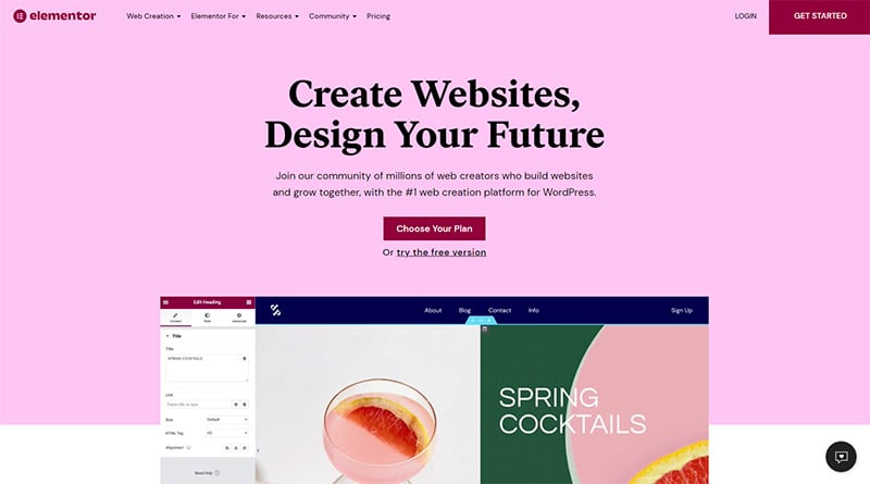
Elementor
A minimalist design is used here with a simple pink background. The website for this popular WordPress page builder employs its own techniques that it advertises with a pink-on-black design that helps to draw attention but is not harsh on the audience’s eyes. Movement within the frame of pink spot color helps to create a layering effect.
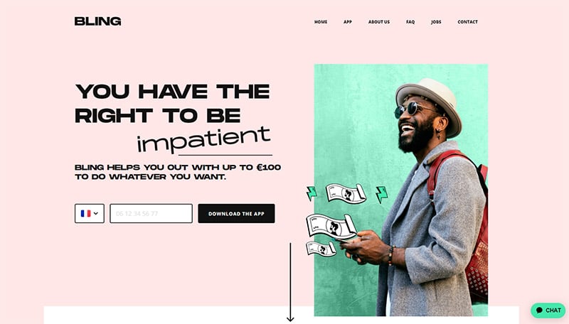
BLING
Does pink have to be only feminine? Pink used with the right complementary colors can be used to evoke a cheerful, yet subtle feeling from a web design. There’s a calm color palette to Bling’s use of a faded almost opal-inspired pink shade. The spot color choice of green helps to communicate to money because green equals money, right?!
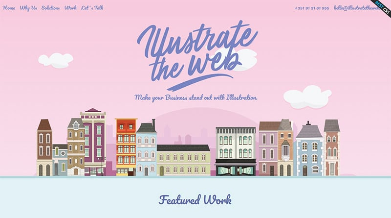
Illustrate the Web
Primary sets of illustrations and the use of primary colors that include blue colors in contrast to the soft pink highlights. This helps to draw pink as an accent color rather than an overall design element. The choice of typography, as well as the color palette, communicates an elegant design choice from the Victorian Era header to the illustrative examples to follow.
Bond
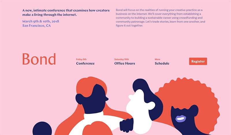
Pink color palettes are used with purple elements to fuse amazing color strategies in communicating inclusion and equality across the board. This brand company that holds conferences on inclusion, communication, and work communities used pink in a great way with illustrative power.
Denise Chandler
Creatively using illustration and cartoon action buttons to introduce a team of designers. Pink is used as a 1950s element to present an online storefront. This soft feminine site is inviting for people looking for those feminine touches to web design or a font palette.
Unleashed
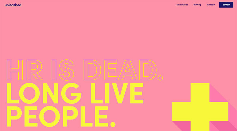
Creative web design starts with pushing limits in how colors work together. The yellow color used here with a pinkish-orange shade helps create a pop effect. Scrolling through the website moves the screen into a visually stimulating color palette of text and background keeps the audience engaged. This is a graphic design success by incorporating pink as a non-feminine design element, but rather as another design scheme.
Quentin Goupille
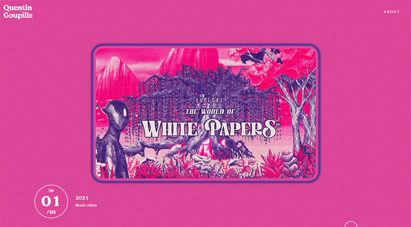
Portfolios are meant to grab the viewer. The subtle black background and menu opener of soft pink fade into a loud pink attention grabber that creates an amazing visual effect and is on top of the list of graphic design ideas to incorporate pink creatively into a web design.
BBDO
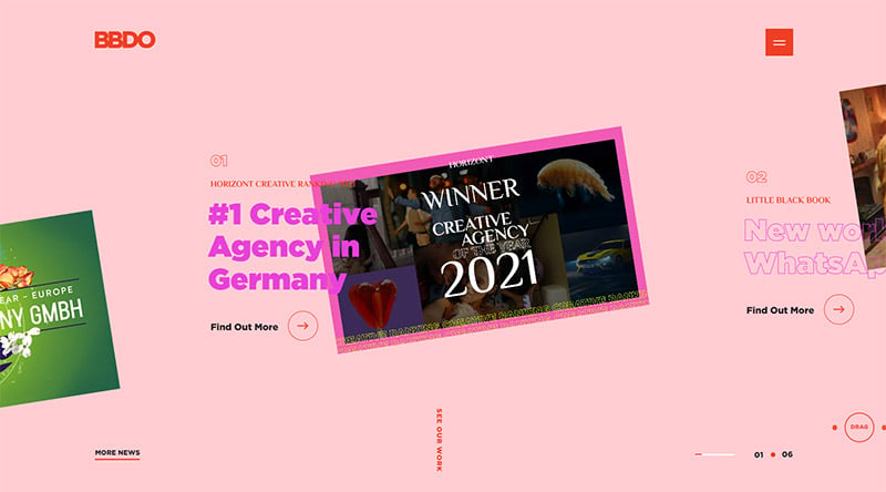
Pink and red work together as like colors on the color wheel. This site also uses an animated menu opener. The project images are used as visual elements to stand off the shaded pink background on the sight. Hollow typography used within the titles of the work gives a great visual element on a black background. Pink is used throughout the site in different ways from block color, typographical color, and movement color to create a cohesive theme.
Tumult
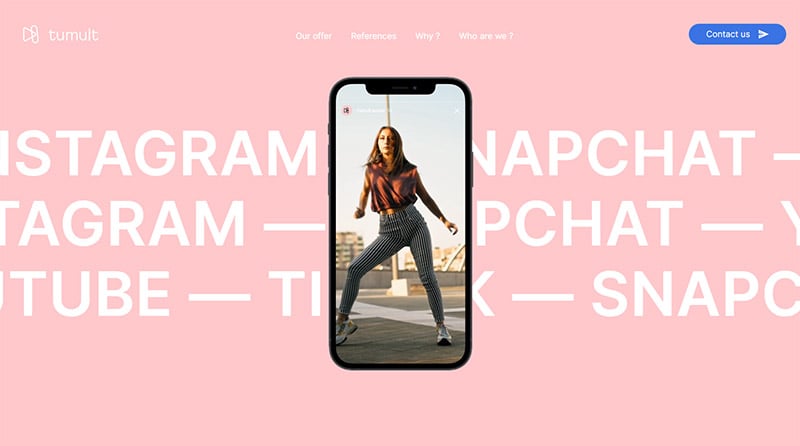
A gorgeous color palette that is simplistic on this French-designed site is inspiring. A girly color like pink is transformed into a soothing interactive marketing campaign for Tumult. Video elements are incorporated into a creative web design that helps to communicate the video is social. The motion of the text with the movement of scrolling menus and video help to communicate the company’s services and goals. The French production company helps their clients utilize the meaning of social online.
Oui by Jean Dousset
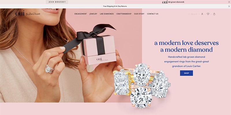
Pink truly at its root is feminine in nature. What better way to communicate elegance, love, and jewelry than with the color of success…pink. A shade of pink is used for each banner as you scroll through the website. Blue typography works well to keep the soft look to the pink details all over the screen. The entire website utilizes pink tones.
Groupe Castor and Pollux
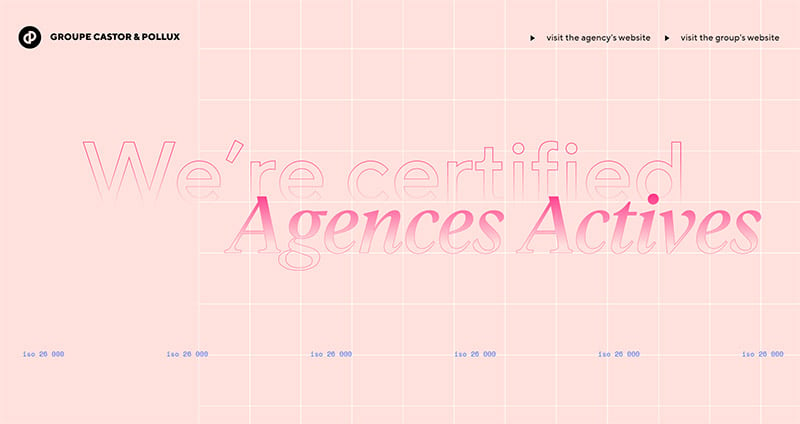
A pink color palette website such as Groupe Castor and Pollux communicates equality for genders. Blue is the textual and scrolling color scheme that communicates gender equality together. Color combinations here are very simple and at the forefront of the design. Blue details for each popup help to show the transition from element to element on the website.
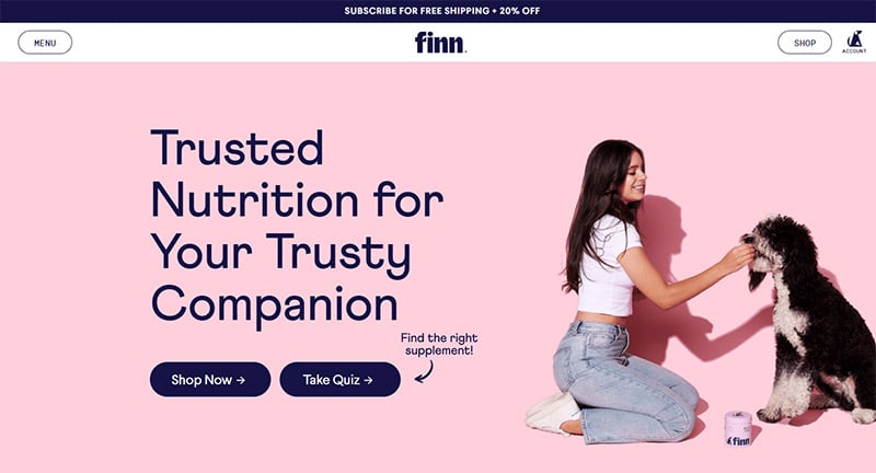
Finn
Primary colors always communicate a sense of youthfulness and joy. Here the huge typography combined with an electrifying color scheme helps to create a sense of joy and energy that pets bring to our lives. It also communicates with fresh colors from the product photos incorporated into the overall website design that health for your animal is important.
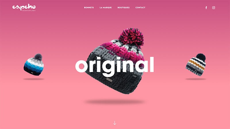
CAPCHO
Category buttons on top of a pink color scheme pop this pink website to the top of design genius. Movement and characters help to create design elements where typography is the key ingredient to add depth and versatility to this site. The faux-inverted color effect gives depth to the photos and the text on the pink background.
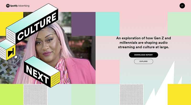
Culture Next
Geometry is utilized on the landing page of this pink-inspired website making a generational shout out to Gen Z. Creative design services are available here on this website for Spotify advertising. Using huge typography and amazing examples on the home page for advertising with the pink spot color in the video to tie back to the soft gradient of pink and green on the website background is a great design element.
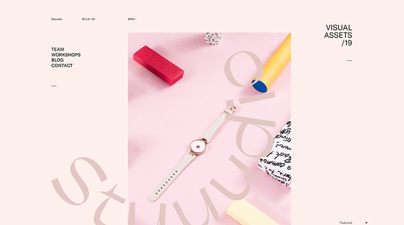
Stuuudio
Creative design studios like Stuuudio know how to create cutting-edge design and use new and fresh color palettes. This soft pink background with off-black text is a great way to use a feminine design to advertise services to a multitude of clients. It breaks the rules that pink is just a feminine color. The featured image blends into its environment and helps to invert the text making it all a design feature to the website.
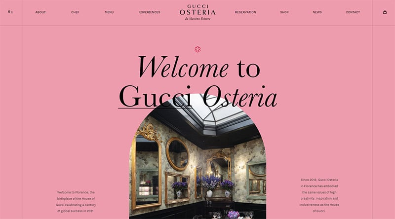
Gucci Osteria Florence
The menu opener in black helps to make navigation easy on this femininely designed site that invites people to experience the cuisine, not just go out to eat. Cathedral window cropping of the images used helps give gorgeous examples of how you can utilize feminine elements with a pink color scheme.
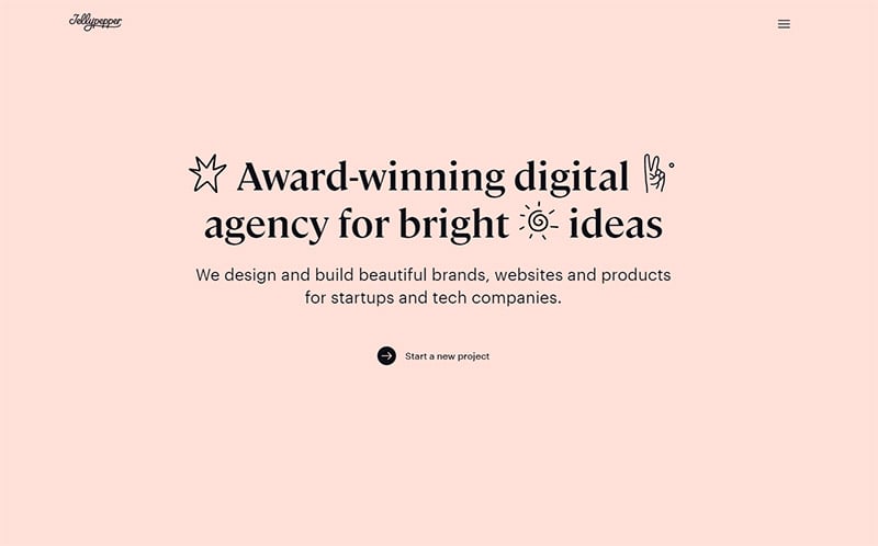
Jellypepper
A calm color palette helps to make a screen inviting in a world of loud visual noise. The block blog style of presentation gives the audience their choice of what information they need from this web design. This site inspires others to be creative in a design contest by utilizing soft pink color schemes in the background. This website helps lead you to experience a design agency relationship in a positive way. A horizontal web design layout keeps the information organized based on the subject.
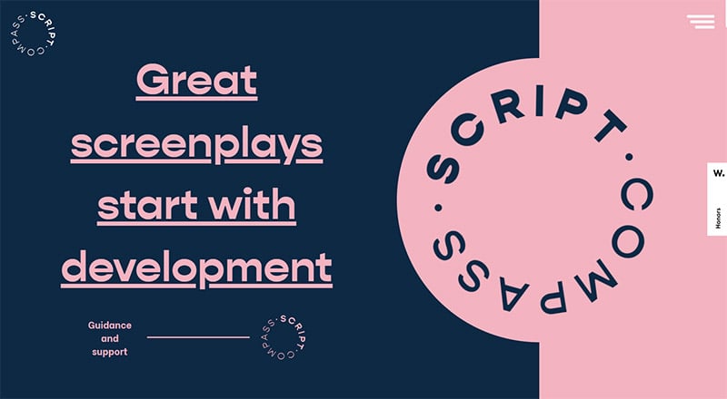
Script Compass
A puzzle piece entry and a turning text element gives this website a great working background of blue and pink. It has an “unlock me now for your options” feel. Inverted colors utilizing pink as a sub-component is something that might not put pink at the forefront but uses it as a highlight of the design. Pink does not need to be the only color in mass availability on a website in order for it to be powerful.
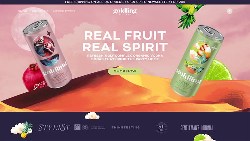
Golding
A green color palette works in combination with pink to emulate a sunset on a beach somewhere. For a graphic designer, this must have been an amazing web design project. This uses motion, color awareness, action buttons, and moving menus. It works together for a tropical feel, marketing a drink that everyone wants while on vacation.
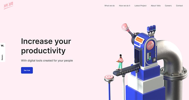
Yaya
Pink communicates retail right!? Since women are more likely to hit the “buy it now” button pink helps psychologically make people think this is a buy it now opportunity to increase your site’s productivity and movement to income. Action buttons are front and center in a distinct color palette. Pink color elements are used on motion graphics to work with the blue in a complementary way.
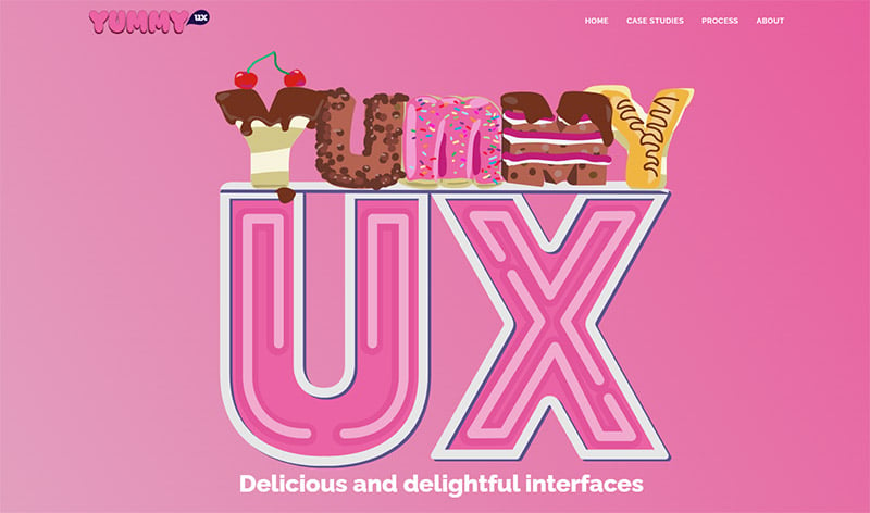
Yummy UX
Bright pink, huge typography, and a cartoon button for the home page create an emotional connection to your childhood ice cream truck that has your favorite frozen yogurt onboard. The services communicated are friendly and not intimidating with the use of bright pink. Cartoon design elements and shade variation help with transition on the site. Simplistic illustration keeps the message simple on how a branding company can help the client brand simply.
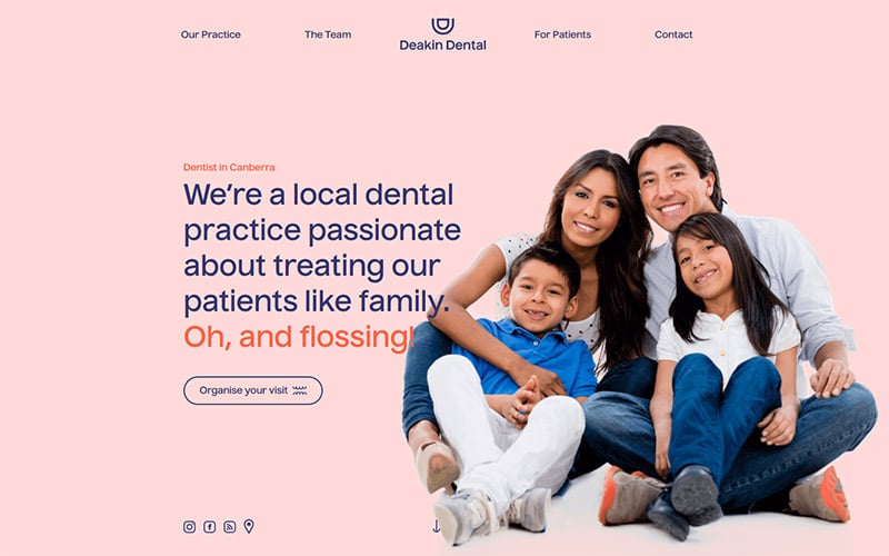
Deakin Dental
This site’s color palette helps to work harmony in the website design for this Australian dental practice. It is soothing and calm, since most people historically are fearful of the dentist. It is a welcoming site with a scrolling effect. Scrolling websites are now the rage since most people are mobile on their phone and scroll at the touch of a finger. The soft pink color is easy on the eyes of the viewer. Sometimes stark white is just too much.
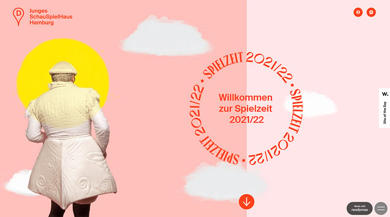
JSH Spielzeit
Bauhaus design is revisited with this website in how pink, yellow, orange, and shades of purple are utilized in a geometric pattern. German design is clean and stark by nature. Color intensities are alive here on this site making sense of color schemes with contemporary design solutions for the web.
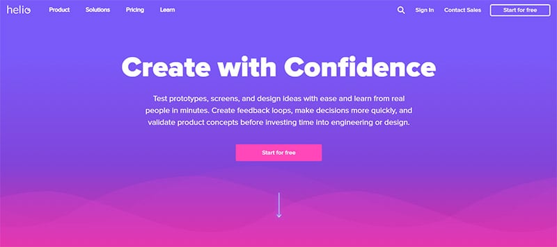
Helio
Bright colors help to pull the vibrancy off the screen and into the audience’s space whether viewing on a desktop, laptop, or mobile device. The call-to-action button is front and center on the home page and welcomingly communicated with bright colors in the foreground and background. This site easily demonstrates how utilizing pink can create energy for future projects that you wish to create with surveys or activating audience participation.
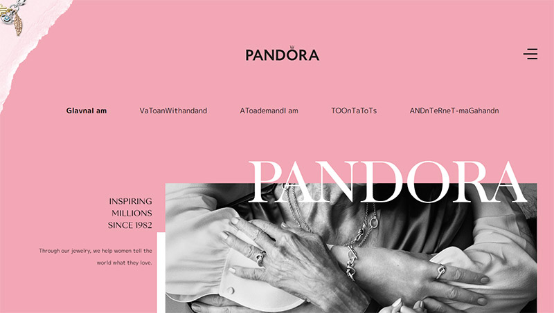
Pandora
This site oozes fantastic design inspiration for an avid graphic design lover. Elegant elements and the liquid droplet filter applied to the home page photo when you scroll over it exhibits superior design skills that embody and embrace the gentle color palettes of pink and black. A feminine color is turned into an elegant design element for all.
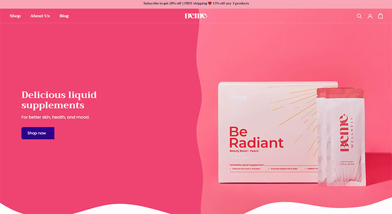
BeMe
Amazing color strategies are realized with the BeMe Wellness site. It is a simple design for the landing page. It helps to communicate the excitement in the product by using an ever-changing background color palette. A top running menu helps to hold gravity to the motion graphic to the right of the page. Pink is the base color and the color wheel rotates to the right through amazing complementary colors that help to create visual stimulation to the site.
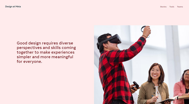
Design at Meta
A minimalist design is used here at this metaverse. It is simple shades of pink that work together with other design elements to tie together a powerful message with very little on each screen. It is widely known that the online audience only views a screen for so many seconds before they decide if it is worth their time or not. Design at Meta helps to harness a gentle shade with a featured image and a text widget that encapsulates their goal in a few seconds.
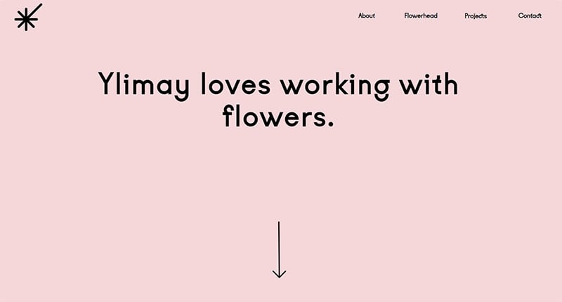
Ylimay
Pink! Blue! Green! Yellow! To close our 30 choices of pink websites, this example shows how pink website designs can utilize the change in background colors to communicate the moving text in the header and the menu as you scroll. The quick change in colors before fading back to its primary pink color elements used upon the initial load of the site, Ylimay used fundamental and minimalistic style to use pink to its best advantage.
Final Thoughts on These Pink Websites
As you can see above from 30 amazing examples of pink websites, a pink color palette website is more than just garishly on display. It is the color scheme used in so many different color palette combinations that takes it from a feminine color to a design element by amazing designers works.
Fashion designers, beauty concerns, an elegant menu bar, and dark shades help to inspire compensation from companies to use this new tactic of pink online. Remember that everything from bottle design to business card designs, pink can be utilized in a powerful way for your new marketing strategy and branding storefront online.
You may also be interested in the other articles in this series:

