30+ Purple Websites for Your Design & Color Scheme Inspiration
This page may contain links from our sponsors. Here’s how we make money.
It’s important to consider the psychology of color when designing your website. Not only do colors help a user navigate your site, but certain colors tap into the user’s psyche and can make or break the success of your website. Today, we’re here to showcase the best purple websites to inspire your own design.
The color purple has long been associated with royalty, control, and wealth. It’s also commonly considered to be the color of magic and mystery. It’s a top hue of choice for companies and luxury brands that want to present themselves as ‘the best of the best.’ It’s a good choice if you want to convey a message of trustworthiness. What’s more, a purple color scheme works well for anything with a mystical vibe.
Showcase of Purple Websites
If you’re designing a website and have chosen a purple color palette, then you’re in the right place! We’ve pulled together this showcase of more than 30 of the best purple website designs to inspire you.
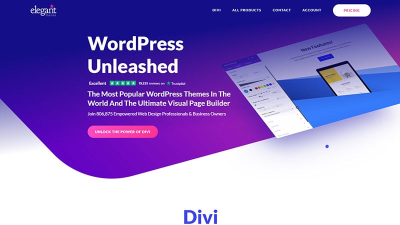
Elegant Themes
Elegant Themes makes an extremely popular drag-and-drop builder for WordPress. If all their 5-star reviews don’t make you believe that, the purple gradient they used in the website design is there to help build your trust and confidence.
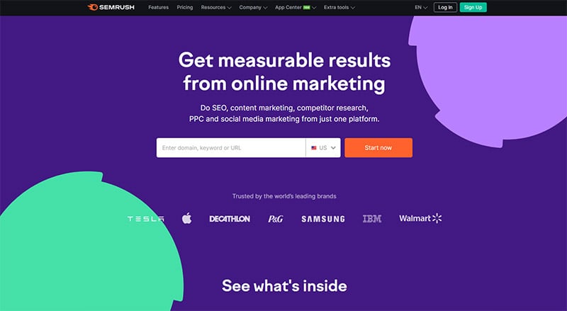
Semrush
The plum background of Semrush’s website helps potential customers trust Semrush’s SEO tools for marketers might be a better option than their competition. Notice that purple and other pastel colors were not chosen to match the company logo, which is black and orange.
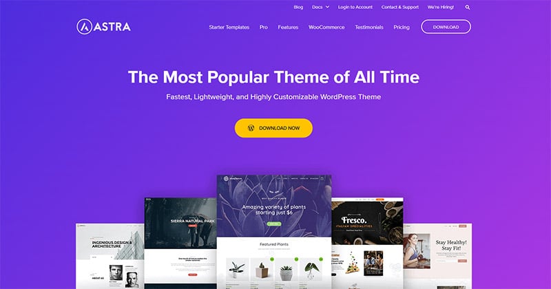
Astra
The purple gradient pulls you right in, and that contrasting orange button tells you exactly what to do. Go ahead and download the most popular theme of all time — you know you want to!
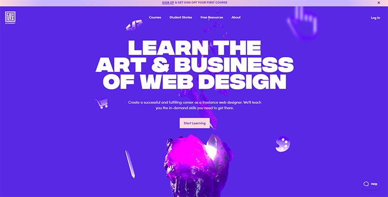
Flux Academy
Even the Flux Academy (who teaches the art & business of web design) thinks that purple is the color of choice when it comes to compelling websites. This one is practically all tones of purple, lavender, and pink.
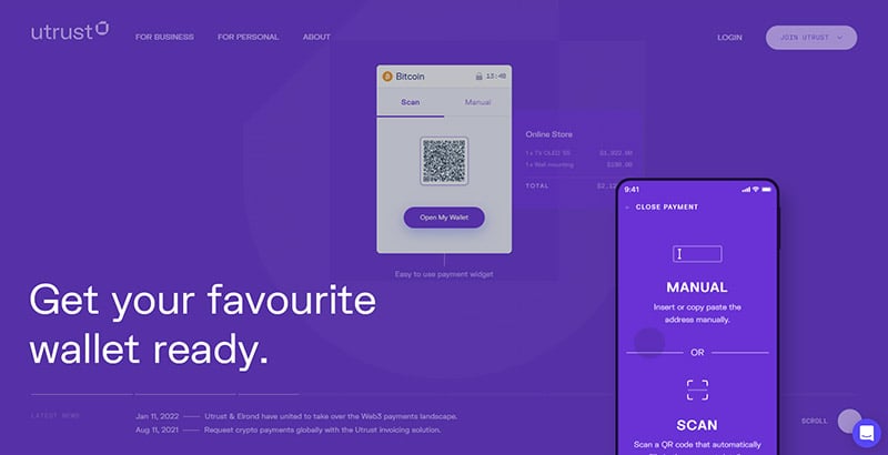
Utrust
Utrust is an app that allows businesses to accept cryptocurrency. When your brand literally has the word “trust” in the name, expect to have purple as one of the dominant colors in your web design.
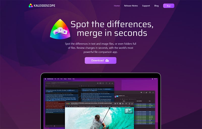
Kaleidoscope
Here’s another application that relies heavily on consumer trust. So it’s no surprise that they turn to shades of deep purple in their website design. The coloration instantly imbues a sense of confidence.
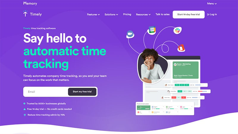
Timely
If you’re going to allow this app to track your every move on the computer, you need to have complete confidence in it and the company behind it. That’s why it’s designed with hues of violet, amethyst, and orchid with pops of trustworthy teal.
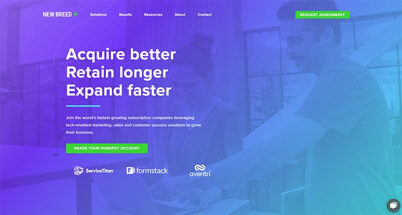
New Breed
New Breed is all about helping companies acquire customers and keep them, therefore growing their business. A clean design with a gradient from light purple to aqua portrays the feeling of wealth and growth.
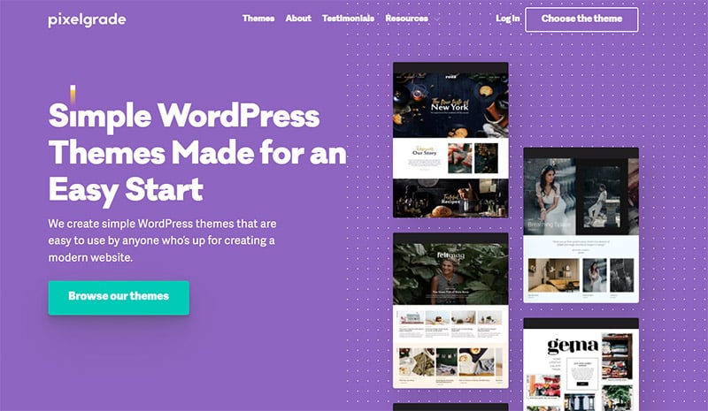
Pixelgrade
Pixelgrade asks, “Why trust us, right?” right on the home page. They reinforce their trustworthiness with an amethyst background right at the top of the page.
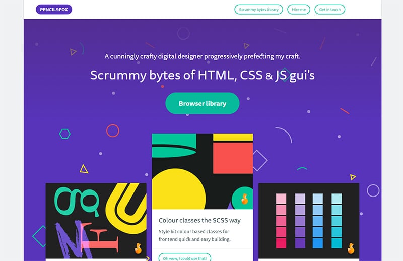
Pencil & Fox
This is a library of ready-to-use snippets of code free for the taking. The deep purple background, spattered with multicolored design elements shows they know exactly what they’re doing but they still like to have fun.
Digimurai
Here’s another very clean design with a simple purple color scheme with pops of magenta. Purple and magenta are an amazing color pairing — analogous on the color wheel, meaning they are next to each other and look great together.

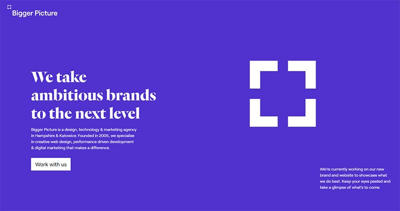
Bigger Picture
This web design studio and marketing agency uses purple as their main choice of color. If you scroll further down the page, though, you’ll find a complementary color, yellow, that’s a bold choice to mix with purple.
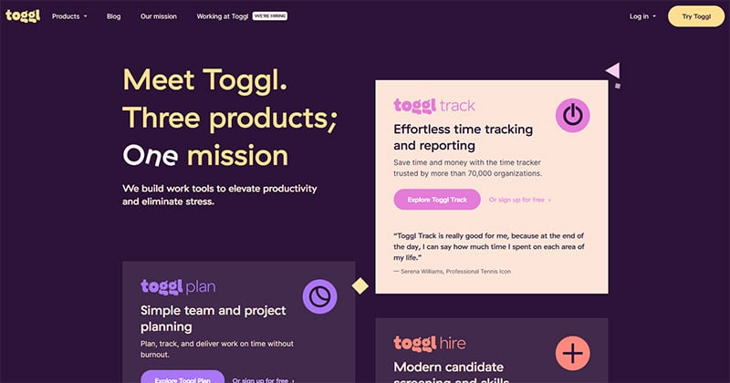
Toggl
The deepest shade of purple can be found in the background of this website for Toggl, a time tracking, project planning, and hiring application. It also mixes a few unique complementary and analogous colors that create a compelling story.
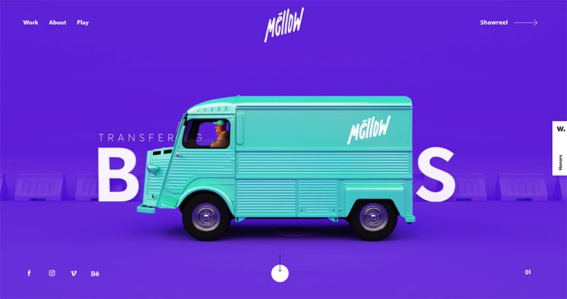
Mellow Studio
This motion & sound studio in Greece should portray confidence and luxury. They need to show professionalism, quality of work, and that they are the best. They do that, in part, by using purple color theory on the home page of their dynamic company website.
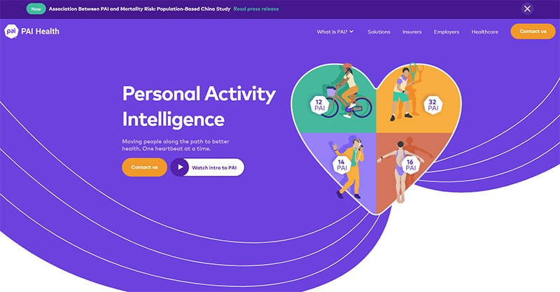
PAI Health
PAI Health helps companies learn valuable information about real people based on their wearable activity trackers. The medium purple color they used for their primary color palette along with lighter shades of purple, teal, and orange give a feeling of professionalism and caring.
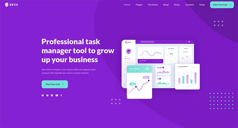
Deva
Shades of purple, lilac, and aqua make up the color scheme for Deva, a task managing software for business owners. These calming colors are popular choices to use together in purple website design.
Bounteous
This design agency specializing in digital content needs to have an absolutely killer website. When the best of the best build a website for themselves, what beautiful color scheme do they choose?

Purple Bunny
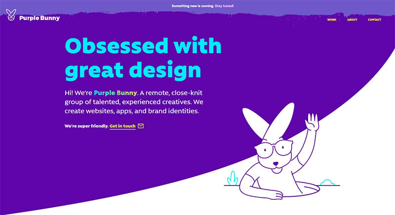
When you’ve got the word “purple” in your name, purple will probably be your default background color. That said, we love the lighter shade of lavender in the bar menu and the use of aqua and yellow for contrast.
Bootstrap
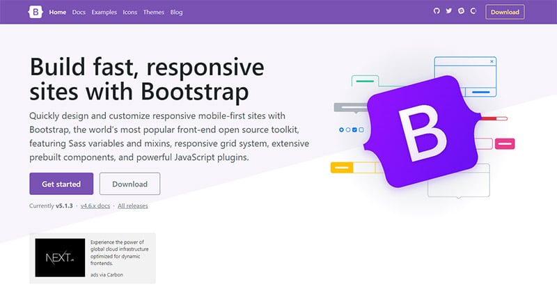
Software for building responsive, mobile-first websites, Bootstrap is designed with a clean, extremely light pale purple and white background. It also uses a lilac shade for the menu bar and color on buttons.
Glia
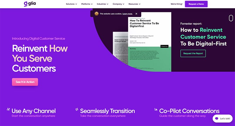
Customer service demands that companies are open, honest, and trustworthy. So, it’s no surprise that Glia, a company selling customer service as a digital product, uses a purple color palette and other pastel colors for their website.
Rentberry
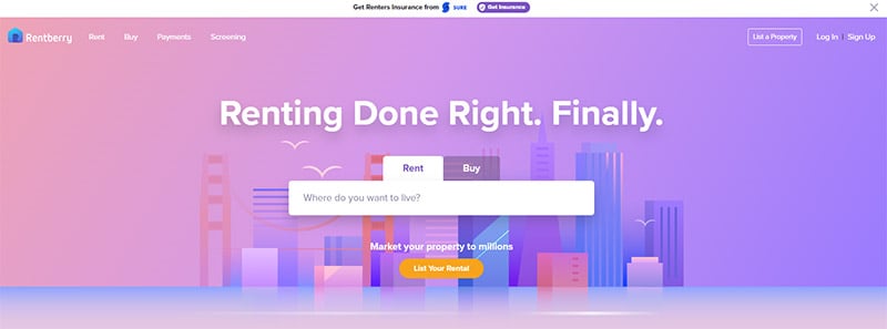
Rentberry’s site could go on a list of pink websites, too, but it uses color transitions to blend beautifully to a lovely light violet color, so the color motif works here, too! Plus, most of the website’s buttons are purple or a contrasting orange.
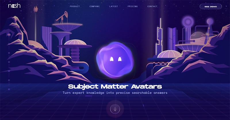
Nesh
This is one of our most intense purple web design inspirations. Nesh, an AI Avatar for answering questions on your website, shows a futuristic land at night — there wouldn’t be a better color palette than purples and blues to use!
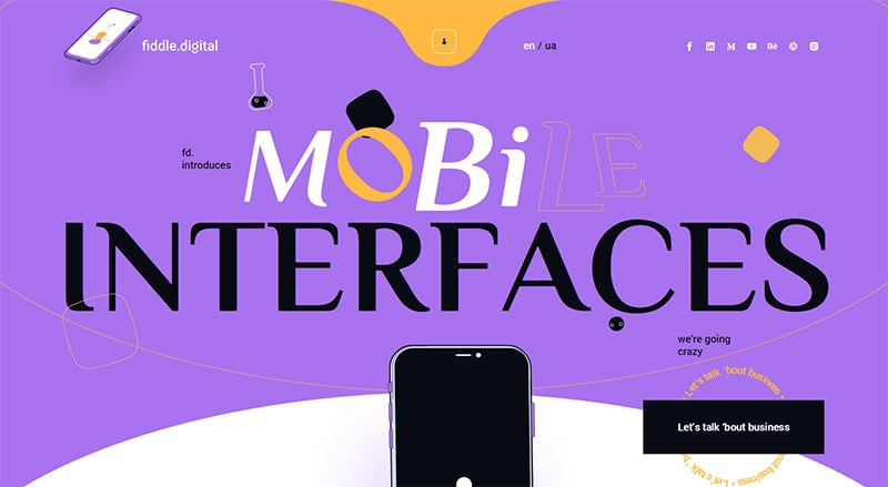
Mobile Interfaces
Here’s a perfect example of using a complementary color palette for your design inspiration. In this case, Mobile Interfaces went with a lilac shade for the bulk of their site and then chose a golden-yellow for the accent color.
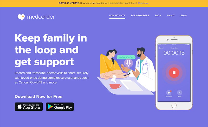
Medcorder
This periwinkle website could pass for color palette blue websites, but it also works for purple web design inspirations. The calm color palette in the illustrations is a perfect complement to the motif and fits with the mission of the company.
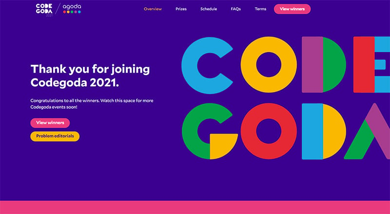
Codegoda
Agoda’s programming competition website uses a purple color palette with bold colors as accents. The color scheme gives the impression that the event is fun and exciting.
Taco Bell
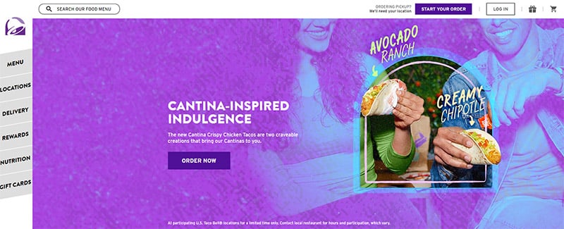
A purple palette isn’t something you normally see with a restaurant, but then, Taco Bell isn’t your typical restaurant! The lilac shade is duo-toned with aqua for interesting imagery while a deeper purple is used for their order now buttons.
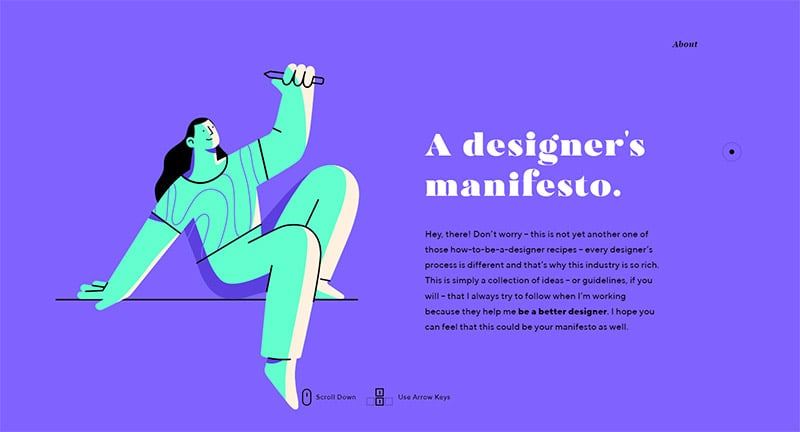
A Designer’s Manifesto
If you’re a web designer, check out this collection of ideas that help make you a better designer. And, notice that the designer of this attractive web design chose light purple for the home page background color.
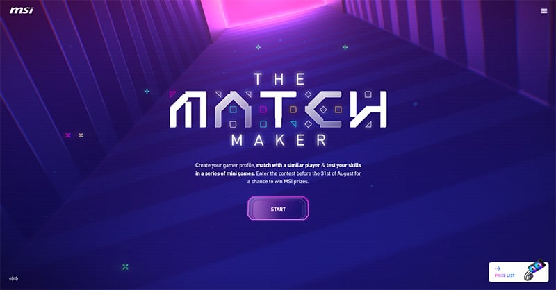
MSI
This online gaming site has a really cool, retro-gamer digital design background — purple tones, of course, that eventually changes to a bright, fiery hot pink.
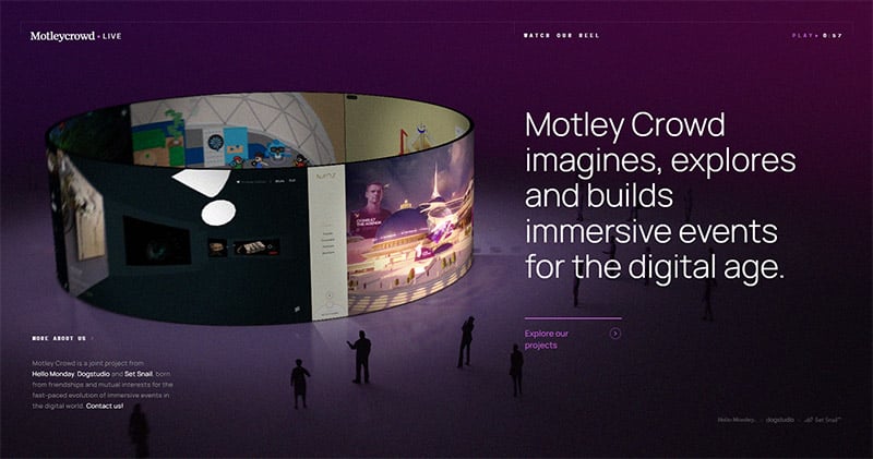
Motley Crowd
The gorgeous, deep, dark violet color in the background of Motley Crowd’s site immediately pulls you in but doesn’t distract you from the work they want you to see. It has the vibe of watching a large screen at an outdoor venue at night, without feeling too literal.
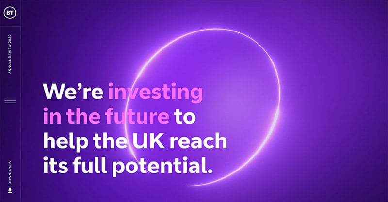
BT Annual Review
BT presents itself as the best-in-class broadband company. When you’re in charge, in control, and the best of the best — purple is the color of choice. You’ll notice there’s even a tinge of purple over the images on the home page.
Guide Guide
GuideGuide is an extension for graphic design apps that helps you create grids and manipulate guides. They use a clean, contemporary web design, with calming shades of light purple.

Final Thoughts on These Purple Websites
Your website design says a lot about your brand and your business, and the colors you use in your design are an especially important aspect of it. If you’re looking to convey luxury, trustworthiness, confidence, quality, and some of the other concepts we’ve discussed above, then using tones of purple in your design experience is a surefire way to do it. We’re sure this showcase of purple websites will provide you with inspiration that can be put to good use with your own design skills.
You may also be interested in the other articles in this series:

