Green Websites: 30+ Sites with Beautiful Green Color Schemes
This page may contain links from our sponsors. Here’s how we make money.
When you’re designing a website, the color palette you use is extremely important because of the effect it has on the people who visit your site. That’s right, color is not just a matter of preference — it’s important to consider the psychology of color, too.
Today, we’re talking about green websites, and we’ve got some gorgeous green website examples to show you.
Why would you go green when designing a website?
Besides being the obvious choice for a brand that wants to leave a positive impact on the environment, different shades of green can be used to represent new beginnings, growth, and abundance. Deep greens signify stability and safety, while brighter greens have a young vibrance that’s perfect for emerging and trendy brands.
Showcase of Green Websites
Below, we’ve pulled more than 30 examples of green websites in all different shades of green to inspire your next website design. Pay special attention when you browse these green web design inspirations. What kind of company chose green for their primary color? What shade of green did they choose? And, what colors did they use along with the green to tell their story?
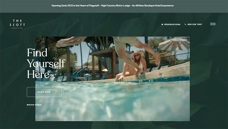
The Scott Resort and Spa
This upscale resort & spa in Scottsdale, Arizona chose a deep green background with green foliage as the background for the site. This tells the visitor that, while the resort is located in the Sonoran desert, you will find yourself in lush accommodations.
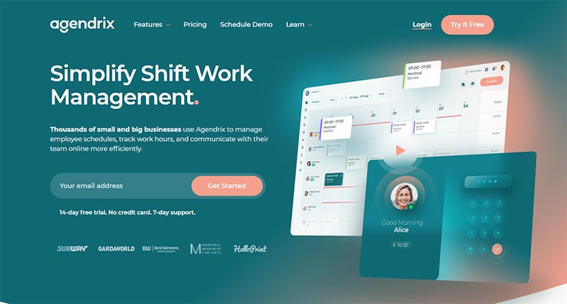
Agendrix
The dark teal color Agendrix used for the main background of their website gives it a sense of calm professionalism. A quality you would expect from an app for managing employee schedules. They also chose the perfect complementary shade of peach.
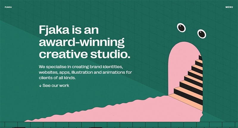
Fjaka
It says a lot about the power of the color green if the Swedish design studio Fjaka chose it for their main color. I can imagine they chose it for its energy and vibrance and how it represents growth, which is what they help brands accomplish.
Christia Fung
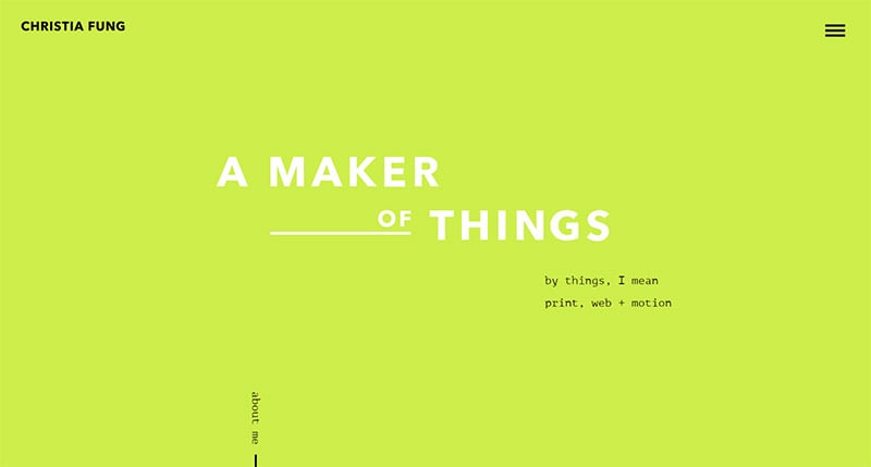
Artist, designer, and ‘maker of things,’ Christia Fung used an awesomely loud and bright shade of green for her website’s home page. Remember, we said the bright greens are great for emerging brands and it’s a perfect color for her.
Clerksy
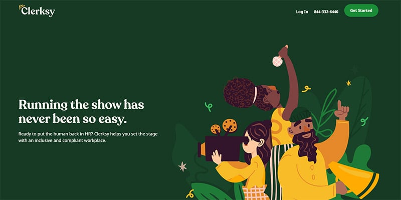
This employee management company chose a deep shade of green for the main color of their company website. Dark green indicates trustworthiness, reliability, and safety. As a company looking to hire them, these are attributes you want. The contrasting orange color they chose stands out beautifully against that bold green.
Schillings
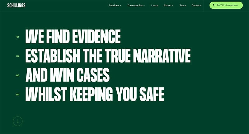
Deep green evokes trust and reliability — exactly the traits you want to see in a company like Schillings, who are experts in reputation, security, and personal privacy.
Chatanooga Festival of Black Arts & Ideas
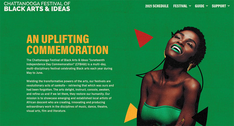
In this green design, the green (along with each of the other colors on the site) was chosen to match the color found on the flags of many African nations to match the theme.
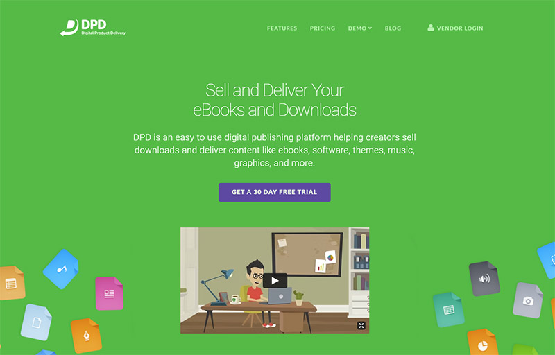
DPD
This site gives users a simple way to sell digital products online. The use of kelly green elements on their website was probably used to symbolize growth, simplicity, money, and reliability.
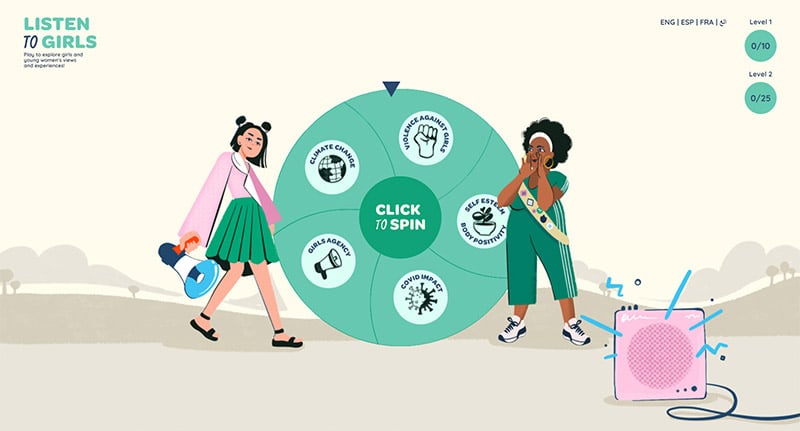
Listen to Girls
Listen to Girls is a non-profit website developed for people to hear the issues faced by girls and young women. It makes sense that this is a green website, partly because of its affiliation with the Girl Scouts and their longtime use of the color green. But green is also a color of youth, growth, and communication.
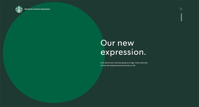
Starbucks Creative Expression
This is a really fun website just to play around with. It uses Starbucks’ iconic green logo color but also uses a darker shade of green in the background and a much lighter shade of green as you scroll further down the page. All the shades used here signify diversity.
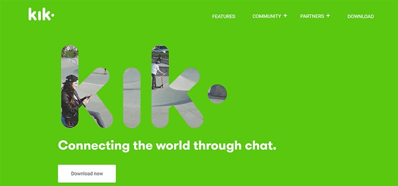
Kik
Remember, green is a color of growth and youth, but also safety and reliability. That’s why bright and light green was the perfect color choice for Kik, a kids’ online chat app.
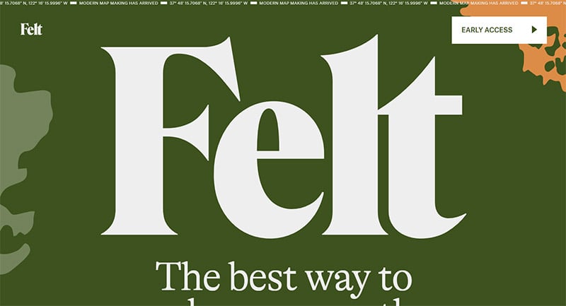
Felt
Greens represent nature and the world around us. Felt sets out to be the next collaborative tool for creating maps of the world. So, the color green seems so fitting. Contrasting white and orange are eye-catching pops of color.
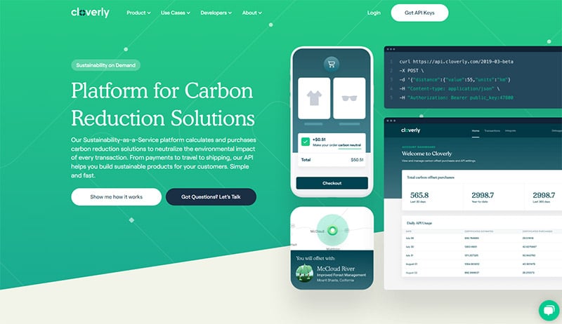
Cloverly
A company with a focus on environmental impact would be remiss not to have a green website design, too. Here, Cloverly has used tones in dark teal for their graphics and buttons, and a gradient from light yellow-green to medium green for the background.
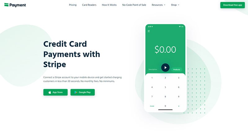
Payment for Stripe
It’s simple, really. Green is the color of money. An app that accepts credit card payments using shades of green for its web design is an obvious, smart choice.
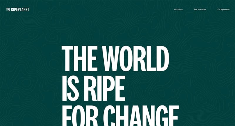
RipePlanet
For a company committed to innovating agriculture, fresh produce, and reducing its carbon footprint, a website with green elements is a complete no-brainer.
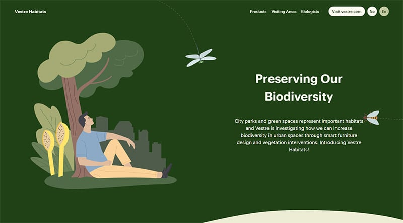
Vestre Habitats
Urban sprawl is eliminating important habitats, but Vestre Habitats is committed to changing that with attractive and effective microhabitats where critters can live in the city. Sustainable life is a theme that’s fully supported with the use of the green color palette.
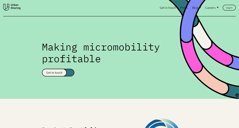
Urban Sharing
Micromobility is gaining in popularity in urban centers for its positive impact on the environment, and so is the need for a program like Urban Sharing. Because of the environmental impact, it makes sense to design their site in shades of green. Pops of bright color make it feel youthful and fun.
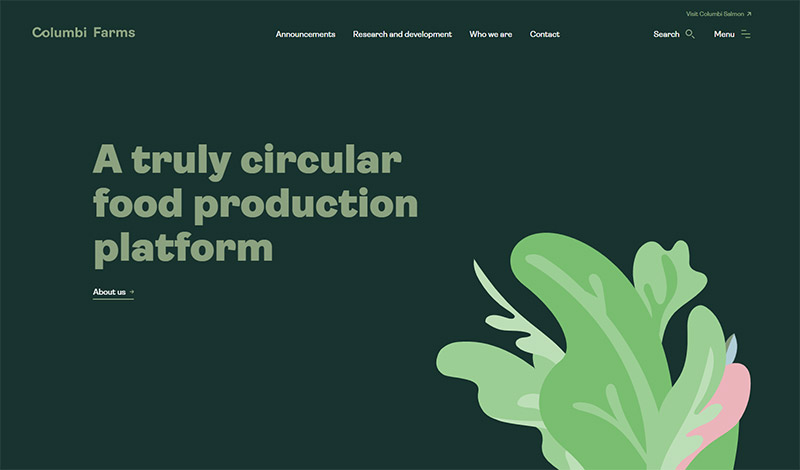
Columbi Farms
This site is for a farm that produces more crops with less land and less waste, with a focus on sustainability. With farming and real foods as their product, it only makes sense to use a green color palette.
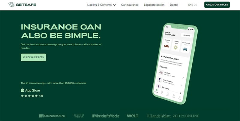
Getsafe
Deep dark green evokes a feeling of safety, reliability, health, and stability. These are traits you would look for when choosing a car insurance company.
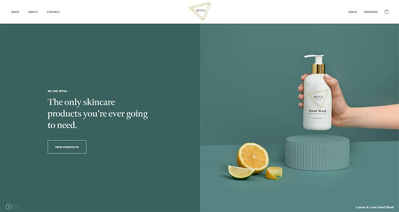
Mysa Skincare
In design, the color green can represent harmony, health, and natural ingredients. So, it’s a suitable choice for Mysa skincare, which uses natural ingredients in its products.
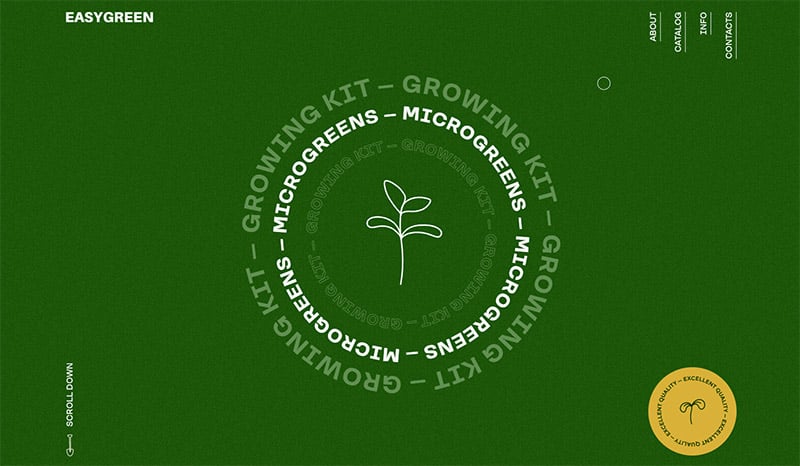
Easy Green
You’ll have fun playing with this one of our green web design inspirations because it’s so interactive. But the first thing you’ll notice is that fresh, prominent green background color. When you sell microgreens, why use anything else?
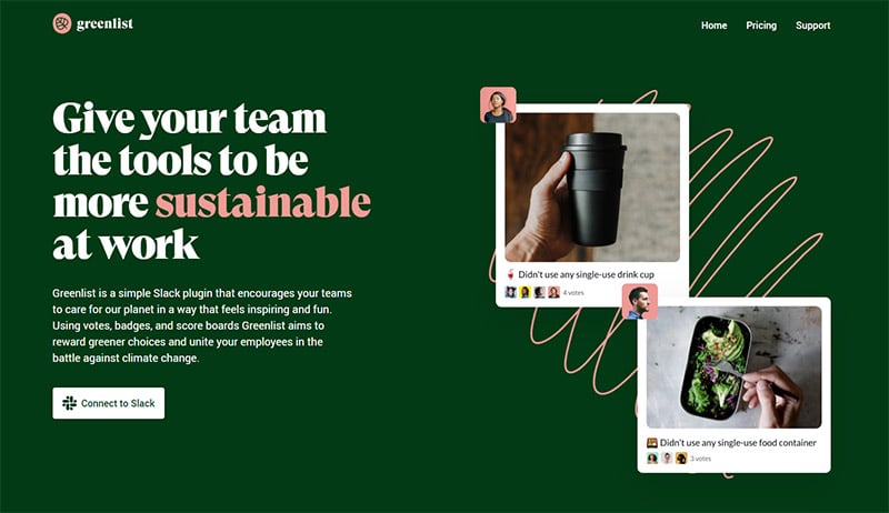
Greenlist
It should go without saying, that if the word “green” is literally in your name, some green color elements are bound to end up somewhere on your website, if not literally the entire background. The use of contrasting pink was a perfect choice.
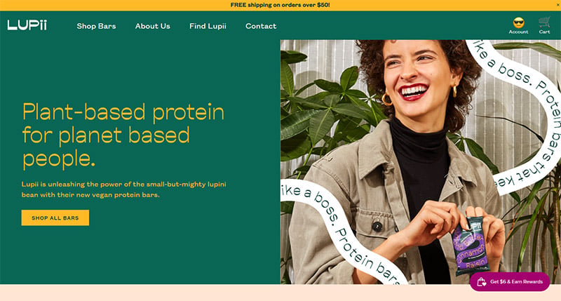
Lupii
Here’s an example of a site that uses some green color elements, but definitely isn’t an entirely green website. The gorgeous green header tells Lupii’s story of sustainability, but they also use a lot of contrasting orange and keep it bright and colorful with photography.
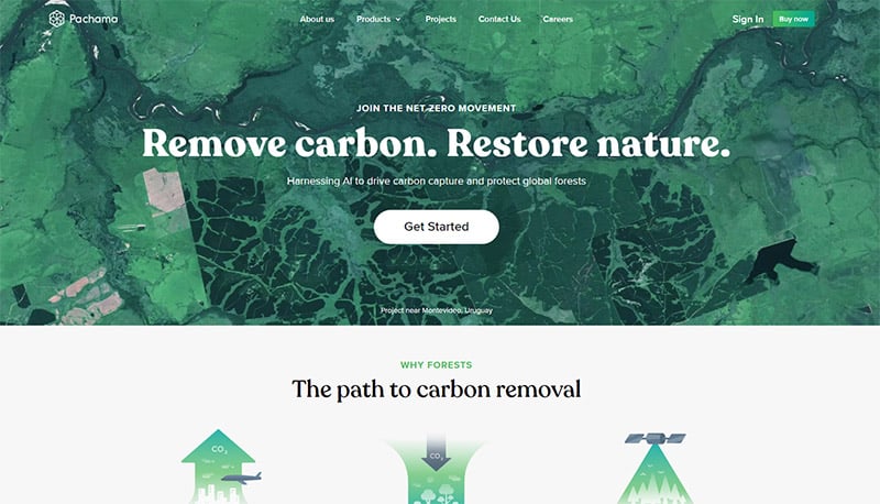
Pachama
Shades of green are used in the photographs all over this website for Pachama, a company dedicated to solving climate change with technology.
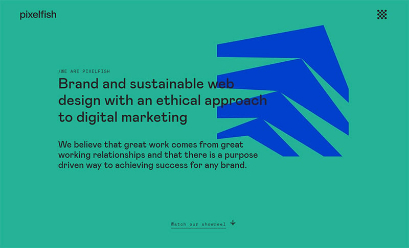
Pixelfish
Pixelfish is digital marketing with an eco-mindset. Anything with a purpose toward environmental causes is very likely to have a green color palette website. And rightfully so! Green represents growth, change, nature, and health. And, quite literally, the environment.
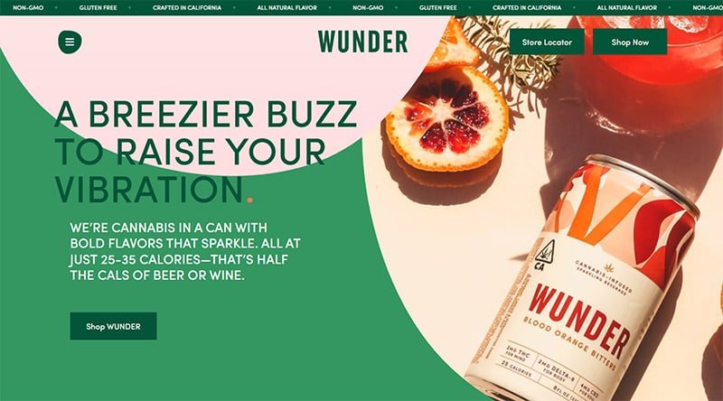
Wunder
Wunder is a cannabis-infused sparkling drink. Green is an obvious choice here because the main ingredient is that infamous green plant, but also because green can be trendy, youthful, vibrant, and energizing.
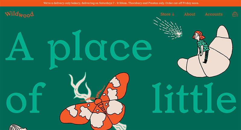
Wildwood Bakery
A local bakery that uses sustainable, real foods and local produce. You wouldn’t think to use green for a bakery website, but it really works for them because of their commitment to organic foods. (And I truly wish I were in their delivery area.)
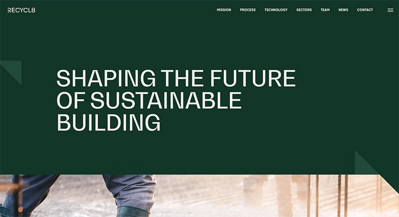
Recycl8
A company that converts waste into quality building material, it makes sense that you’d find green elements on the Recycl8 website. Green is the perfect color to represent their commitments to sustainability.
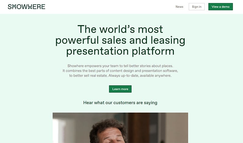
Showhere
The pale green background in Showhere’s website is a solid choice to represent growth, honesty, sales, and money — perfectly suited for a sales and leasing platform for real estate companies.
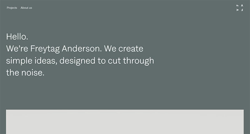
Freytag Anderson
Freytag Anderson is an award-winning design studio in Glasgow. They are free thinkers who like to explore ideas and reach beyond the expected. The gray-green color on their website is calming, professional, conservative, and also represents growth and wealth.
Final Thoughts on Green Websites
Hopefully, this collection of green websites will serve as inspiration for your own green website design. Notice the shades of green that appeal to you the most. And, make note of the colors that contrast and compliment those greens, so you can make your message stand out. White, orange, peach, yellow, and pink are usually great choices.
You may also be interested in the other articles in this series:

