30 Blue Websites with Beautiful Color Palettes
This page may contain links from our sponsors. Here’s how we make money.
If you’ve decided to use the color blue in your website design, you’re not alone. In fact, according to Wired, blue is the most popular color for websites. Not just one shade though. They run the gamut from pale ice blue to deep, dark navy and every hue in between.
So what makes blue websites such a popular design choice?
First, blue is a lot of people’s favorite color, so naturally, it would be a popular choice.
More importantly, designers consider the psychology of color when designing websites, and the color blue signifies dependability, wisdom, security, and trustworthiness. These are many of the traits that businesses want to portray on their own websites.
Showcase of Blue Websites
We’ve pulled together a variety of blue website examples from various niches to inspire your next design. Discover how the color blue works with each type of business. Also, pay attention to what contrasting and complementary colors the web designer used while you browse this collection.
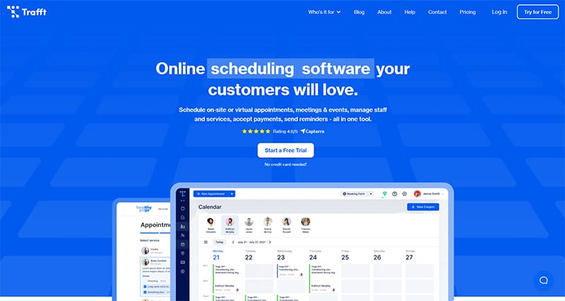
Trafft
The site for this online scheduling software is a bold and bright ultramarine. It conveys a sense of trust. You can relax knowing that your customer appointments, payments, and reminders are handled.
Indicius
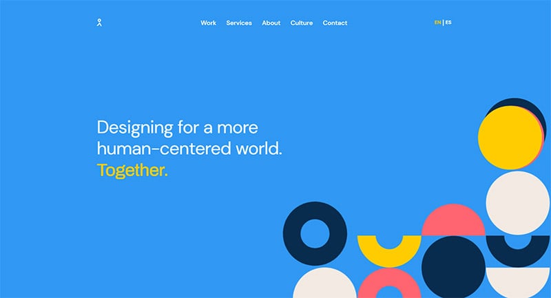
This design house is based in Argentina. They used a Carolina blue background on their home page with multi-colored graphic elements to convey authority and wisdom in their niche, but also energy and fun.
AWeber
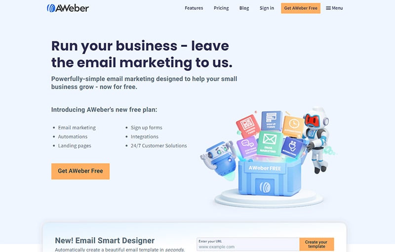
AWeber’s sky blue and black color palette signify conservatism, reliability, and trustworthiness. The designer chose a complementary orange color for the call-to-action buttons.
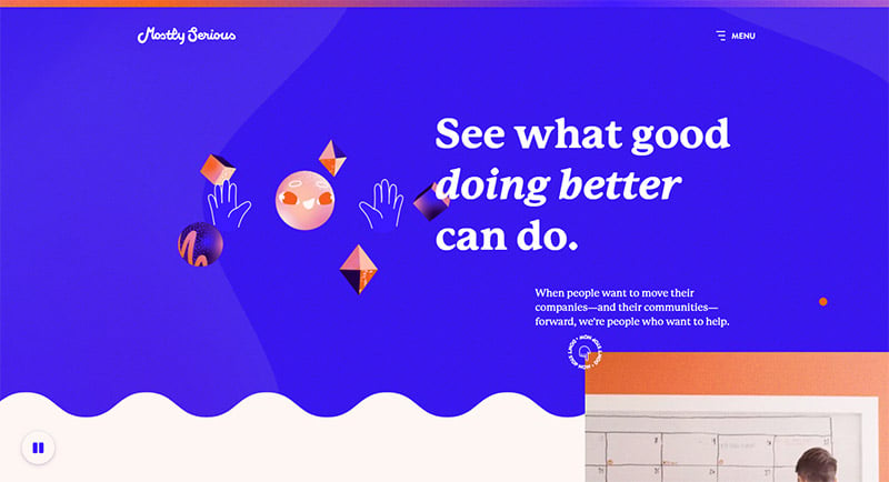
Mostly Serious
Web design, marketing, and branding company, Mostly Serious, chose mostly bold ultramarine for their home page. A conservative choice that’s perfectly paired with animation and lots of unique and energetic orange.
UserTesting
This market testing platform’s website is primarily sapphire blue with dark blue, turquoise, and grey-blue accents. The monotone color palette conveys wisdom, authority, and trust.

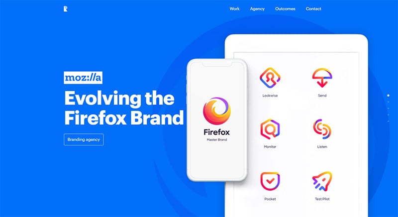
Ramotion
This design team chose a bright sapphire blue for their splash page. This color signifies they are “the best.” After all, blue ribbons are the color of first prize.
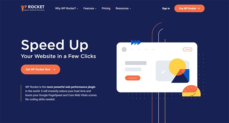
WP Rocket
WP Rocket is a performance plugin that will boost the speed of your website. The deep navy blue on the company’s own site represents authority in the niche, while the orange and yellow lines represent speed and energy.
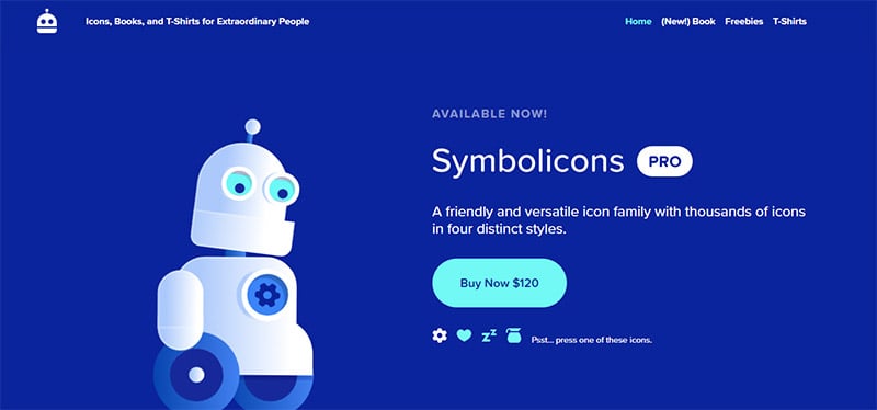
Symbolicons
Symbolicons is a fun and friendly set of thousands of icons for designers created by Jory Raphael. Designed in shades of blue and turquoise, the creative website design is inspiring.
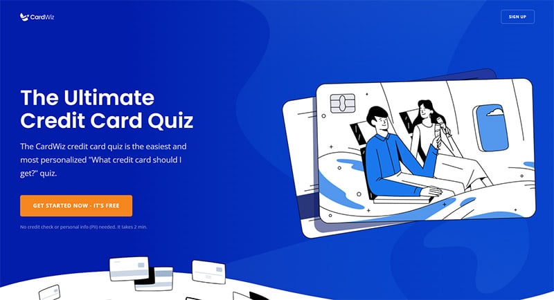
CardWiz
CardWiz helps consumers choose what credit card would be the best for them to apply for. The creative blue-colored website design gives the consumer a feeling of security, safety, and trust with their personal info.
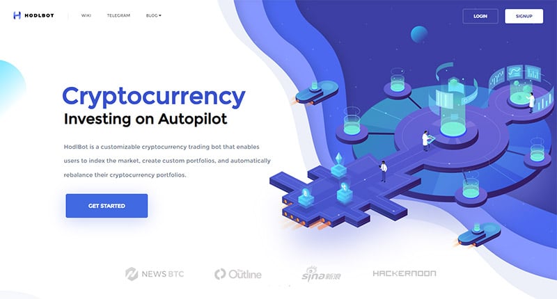
HodlBot
Next on our list of blue website design inspirations, HodlBot is a cryptocurrency trading bot. The use of blue design elements on their site was very intentional since a blue palette inspires trust.
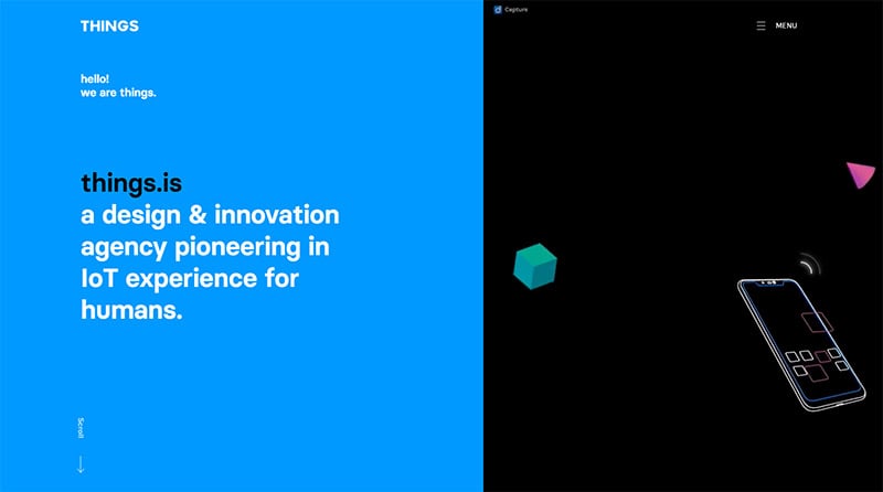
Things
Blue design is a popular choice with electronics and software companies. So, it’s no surprise that Things chose this blue color for their site. Things brings innovative technology to market, and their site conveys wisdom.
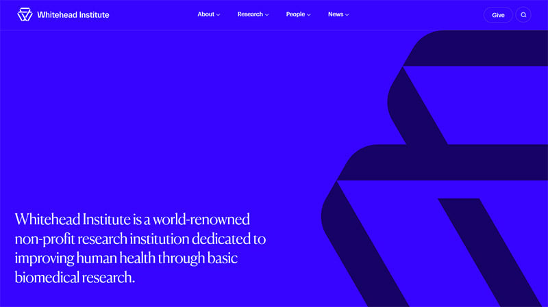
Whitehead Institute
Blue web designs are a suitable choice when you’re designing a website for the health, research, or education industry business because it conveys a conservative, orderly, and traditional feel.
Blocksy
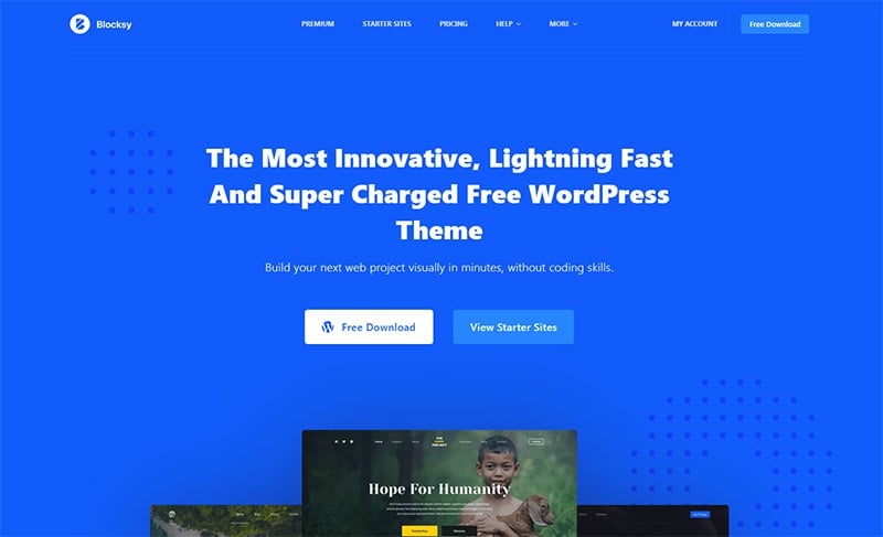
We’re seeing a lot of ultramarine as the primary color on these blue websites! It must be because it’s bright, bold, and clean. Try it for your next design and pair it with orange or white for a classic combination.
Moqups
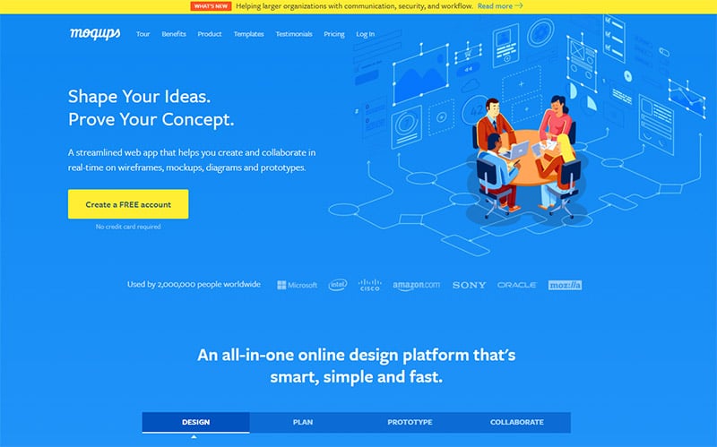
With more and more people going remote, apps like Moqups are gaining in necessity and popularity. Their blue color scheme conveys dependability in the niche as similar apps come to market.
Frase
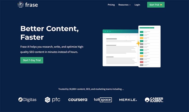
Frase, an SEO content writing app, chose a blue as dark as the night sky for the background color of their website. Darker blue represents authority and intelligence. They wisely paired it with green, the color of growth and money.
Bluehost
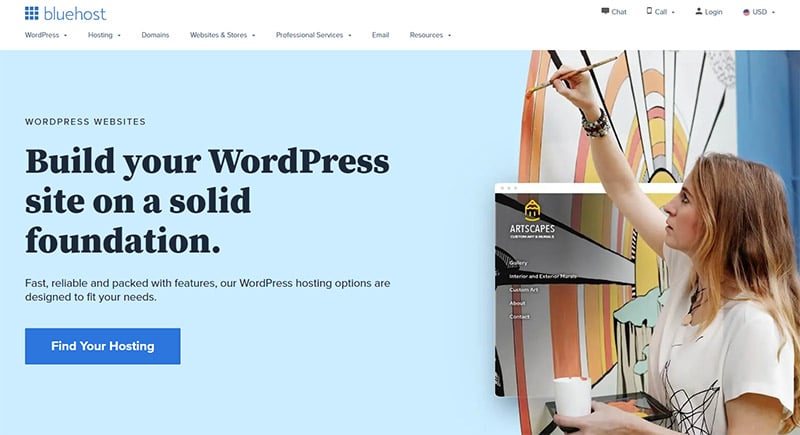
If your company name has the word “blue” in it, you’ll likely have a blue website design. This one, a web hosting service, uses lighter shades that represent reliability — which is extremely important when it comes to website hosting.
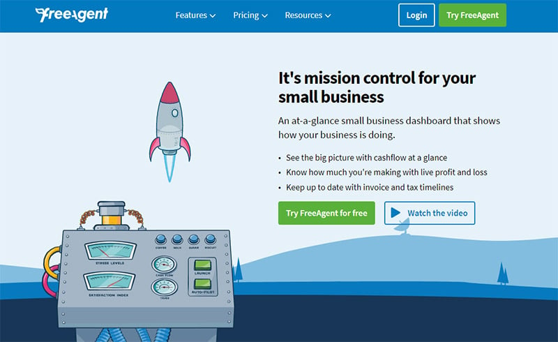
FreeAgent
The next on our list of blue web design inspirations, this online accounting software for small businesses chose a clean design, a medium sapphire blue color, and green call-to-action buttons. This beautiful color scheme conveys trust, security, and finances.
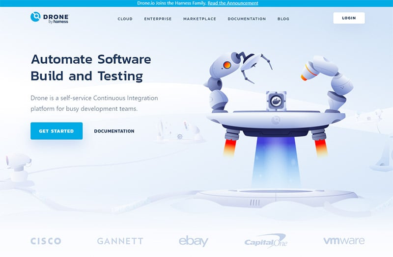
Drone
A very light blue shade makes up the background of the site for Drone, an integration platform for software developers. The calm color palette represents trustworthiness, reliability, and security.
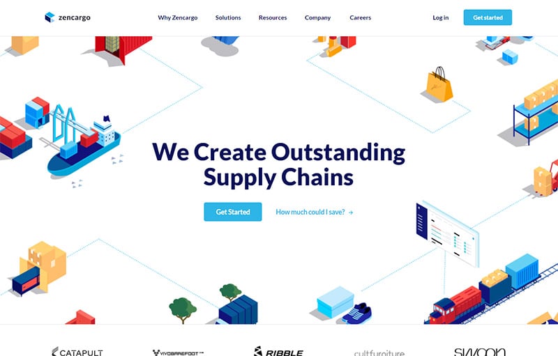
Zencargo
Logistics experts, Zencargo, use a white background for their website, but the dominant color is cyan blue. Here, blue represents productivity, order, authority, and reliability.
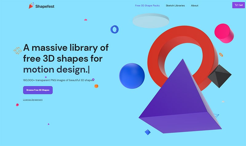
Shapefest
This massive library of free 3D shapes for designers to use (yes, even for commercial use!) is presented on a site with a cool, pale blue background. This lighter color is calming, relaxing, and inspiring.
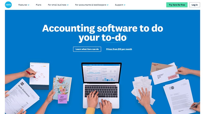
Xero
Blue, bold colors signify security, trust, confidence, and integrity. These are all traits you would want in an accountant — and in your accounting software.
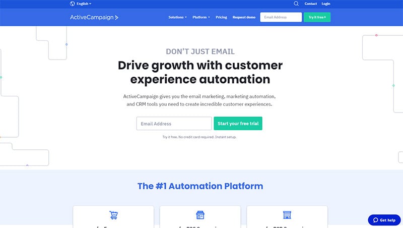
ActiveCampaign
The simple design and clean color palette of ActiveCampaign’s website inspire confidence and trust, convey ActiveCampaign as an authority in its niche, and portray the company as trustworthy and dependable.
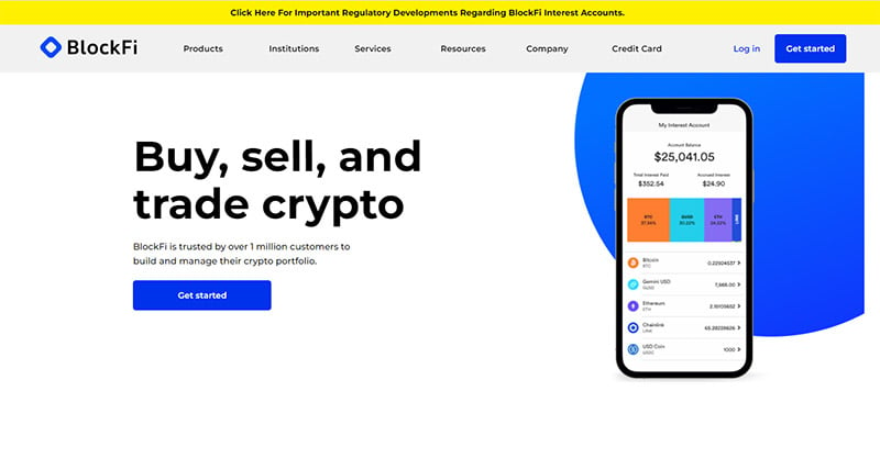
BlockFi
BlockFi is another app to buy, sell, and trade cryptocurrency. If you want to portray to consumers that a company is one that can be trusted with their finances, you give its site a blue design.
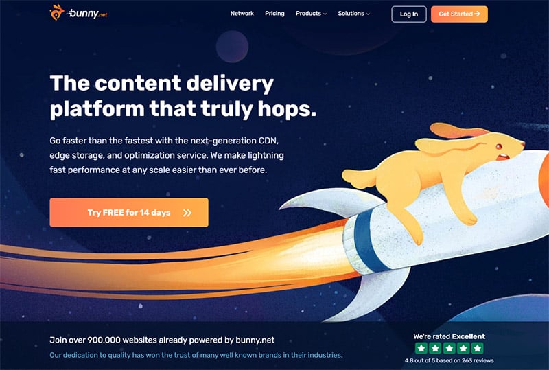
Bunny.net
Content delivery network, Bunny.net starts with a blue color palette and mixes it with complementary orange color highlights. An effective design that conveys the themes of reliability, stability, performance, energy, and speed.
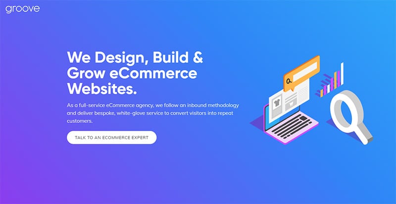
Groove Commerce
This eCommerce web design agency chose a smooth gradient from purple to cyan blue. This was a great choice for a company that offers luxury, white-glove service.
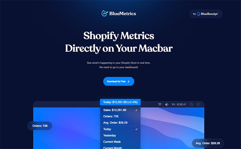
BlueMetrics
If you have a Shopify store, BlueMetrics displays your store data on your Macbar in real-time. With that sensitive data in mind, it’s no surprise they chose a confidence-inspiring navy blue and cyan color scheme.
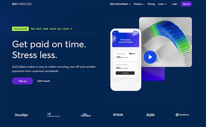
GoCardless
It makes perfect sense that a platform for collecting recurring payments would choose deep navy blue for the background color of their site. As we’ve mentioned, this color shows that the company is one you can count on. Blue is the color of reliability and trust.
Chronicled
Chronicled is another blue website design to inspire you. The light blue background is calm and relaxing, great for businesses in the health and pharmaceutical industry. The purple and copper colors give it an upscale, professional feel.

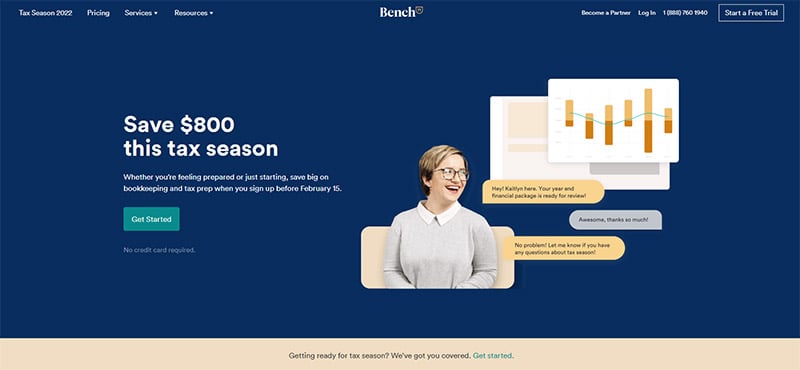
Bench
Bench is an online bookkeeping and tax prep service. The navy blue background inspires confidence in a company that will handle your finances, while the green call-to-action buttons are appropriate for the color of money. Contrasting yellow is a perfect compliment.
Swwim
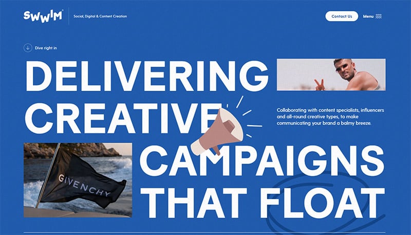
This is a unique blue website design to inspire you! Content creation company Swwim used classic sapphire blue for their background but married it with loud and large text and animated graphics to offset their conservative color choices.
Final Thoughts on Blue Websites
Quite often, your website is the first impression (and sometimes the only impression) your customers will ever get of your company. So, it’s important that you get it right. And that means carefully considering what colors you use in your design.
If you want to portray your business as reliable, trustworthy, productive, and one with authority and wisdom, then be sure to design your site with the color blue. We’re sure this roundup of blue websites will inspire your next design.
You may also be interested in the other articles in this series:

